


Branding & Packaging Design Blog
BLOG

What Makes a Good Logo Design?
“Can you make the logo bigger?” – one of the most common pieces of client feedback, suggesting that they are proud of their brand and what its logo represents. The truth is, if a logo is well designed, it does not need to be made bigger. It should be legible, appealing to its audience, and reflect the brand's character.

When everyone becomes a designer
The rules of design have changed. Today, anyone can click together a template or prompt a composition with AI. But does access to tools equal expertise? Great design lives behind the surface — in strategic choices, production reality, and human touch. In a market flooded with instant visuals, knowing why a design decision is made becomes the most valuable asset.
A Client Walks into an Agency… with AI Slop
More and more often, the first step in packaging design isn't a written brief, but rather... a visual generated by the client using an AI tool. While the intentional use of generative tools is a great privilege of our time, the journey from an initial render to a print-ready package on the shelf is a long one.
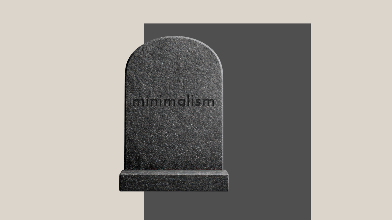
Does Minimalism Still Matter in Design?
That’s something I’ve been thinking about lately. We live in times of overstimulation and visual clutter. When you look at what’s trending for the past few years, you will see maximalist tendencies, but I would argue that the popularity of maximalism doesn’t make minimalism passe.

Brand Loyalty - does it still exist?
On my grandparents dining table, in their kitchen and bathroom, one would always find the same brands, the same packaging. My grandfather smoked a lot, but only Gaulloise cigarettes. My grandma used only Blueband margarine. On the dining table, a standard product used to be Maggi - basically fluid salt.
The Power of Storytelling in Branding
In school, I struggled with history; I could never remember all the dates, and it seemed boring to me. Now, when I think of it, this should be the most interesting subject, but in my experience, most often, it was based on a list of dry facts: no cause, no consequence, no background, no storytelling. So, ironically subject with the most potential has lost my interest forever.

The Queen of All Colours?
Renoir once said “I have been 40 years discovering that the queen of all colours was black”. His ancestors, may thousands years before, might have been among those early creative humans that made the cave paintings in Lascaux, using charcoal as a base for black pigment, alongside other basic colours, like ochre.
Building a Cohesive Corporate Identity - Consistency, Culture, and Connection | part 2
Continuing from our previous exploration into the power of corporate identity, this article delves deeper into how brands evolve, the importance of internal branding, and the role of storytelling in creating emotional connections with your audience. We'll examine how adaptability, employee engagement, and compelling narratives enhance your brand's presence and ensure long-term success.
The Power of Corporate Identity — More Than Just a Logo | part 1
First impressions matter. Whether meeting someone new or encountering a brand for the first time, appearances significantly influence our perceptions. While we shouldn't judge a book solely by its cover, the reality is that the cover often provides the first glimpse into what lies within. This article explores the essence of corporate identity and how it's much more than just a logo — it's the embodiment of a brand's personality through visual and behavioural elements.
Too Yellow to be Yellow
Yellow is a very bright colour that gives an optimal contrast with black. We all know yellow-black warning signs; the ones for toxic or nuclear waste for instance, are mostly made up of yellow backgrounds with black text and icons. The same colour combination is used for many traffic signs, or the "police" tape used at crime scenes.