


white & bright
WHITE & BRIGHT


14/12/2023
If you are Inuit - formerly known as Eskimo - you probably see the colour white a lot. Still, the idea that the Inuit have an exceptionally large number of words for different shades of white is a bit of a linguistic myth; they have many specific terms to describe different snow and ice conditions, which are crucial for survival in their environment.
White - we connect it to innocence, virginity, cleanliness, purity. It is neutral, quiet. We like our teeth to be white. We wave a white flag when we want to surrender.
And although European cultures chose black as a colour for mourning, in most of Southeastern Asia it is white.
Goethe's struggle
Is white even a colour? Is it the absence of colours, or the presence of all colours combined? We probably all know the names Newton and Goethe, and they actually kept themselves busy for quite a while with this subject.
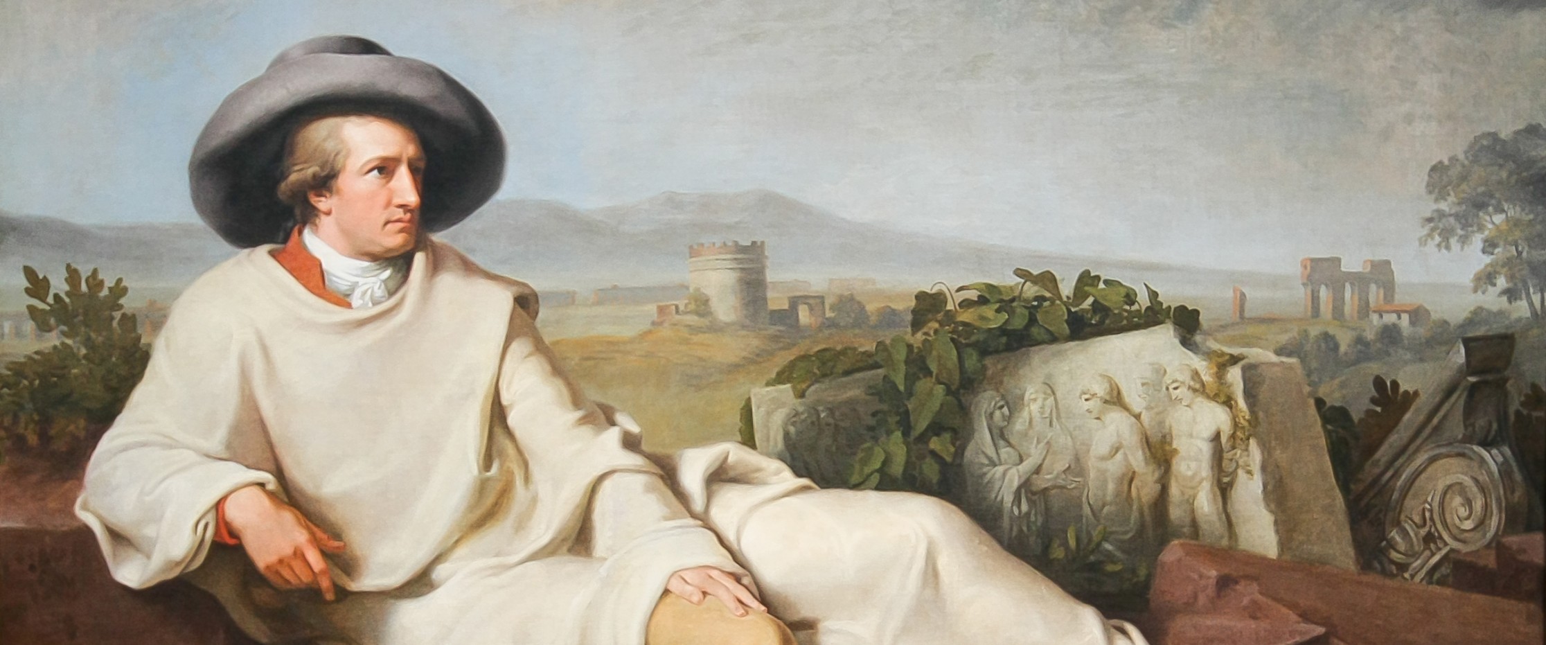
"Goethe in 1787, painting by J.H.W. Tischbein" (source: WikiCommons)
Goethe (1749-1832) was a universal genius. He wrote plays, poems, novels. He was a statesman, a scientist; he published an interesting theory about colours. In which he was, in fact, being most controversial about the colour white.
He stated, that "Colour in itself is a degree of darkness". Darkness is something vibrant that exists permanently, and light is a means to see different colour manifestations with our eyes.
Although his work on colours had a huge influence in his time, on philosophers, artists, and scientist, the main problem was his treatment of the colour white. He actually claimed, that his predecessor Newton was wrong. Goethe's conclusions were mostly based on empiric experiences and observations, primarily focusing on the effect of colours on human emotions and aesthetics, rather than following scientific methods. In contrast, the theory of Newton and his successors was based on excluding the colour-seeing faculty of the eye. Newton understands white light to be composed of individual colours, while Goethe sees colour arising from the interaction of light and dark.
We are not all scientists, but we all have eyes. Besides that, Goethe goes a step further and describes the psychological impact of colours. Newton didn't do that. Newton didn't influence as many famous artists as Goethe's colour theory did: so what does Goethe tell us about emotions, connotations, feelings, connected to the colour white? Nothing. He ignores it. No wonder - throughout his life, Goethe fought against Newton's theory of colours, according to which white light consists of colours. For him, white light was just something pure and indecomposable.
White Solo
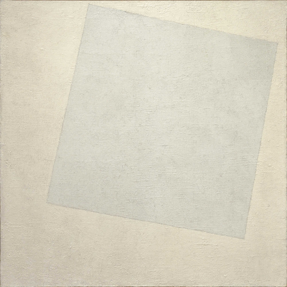
"Malevich' 1918 painting 'White on White'. But is it really white?" (source: WikiCommons)
White as a solo colour is not very useful in works of art nor in commercial designs. White on white does not give high or readable contrasts, and when we add a hint of colour to white, people would immediately say that the colour has changed to light pink, to pastel yellow, or baby blue.
For the ones among us, familiar with Malevich's "White on White" paintings - they are in fact compositions of greyish and yellowish tones. Although the yellowish one could still qualify as "broken white", or beige.
In commercial designs, like packaging or even a washing machine, you need a contrasting colour to make the designs functional. Like black typography, contrasting texts or elements.

"Ever bought a white car? How long did it stay white during winter?" (source: Adobe stock)
White clothes, walls or furniture look great, but over time will turn dirty and greyish. Bought a white car? It will get dirty soon and you will have to wash it more often than any other coloured car. If you put someone who likes minimalist interiors in an empty space that is purely white, this person will probably go nuts within a few days.
The main advantage of white seems to be that it creates a great contrast with most other colours.
White Bright Light
So even when solo White does not seem to be a very practical colour in most occasions; white light is a whole other story. In fact, without white light we humans would not be able to experience any colours at all. In hospitals, surgeons need bright white light to properly see what's going on on the operation table, and McDonald's needs bright white light to get customers out of their restaurants as fast as possible. Say that again? Yes! They need you to decide, order, eat and leave quickly, because their business is fast-food. If they would have candles on their tables, or ambient 'warm-white' light instead of 'cool-white', people would go there for romantic diners and nibble on a cheeseburger for over an hour.

"Fast-food restaurants like bright, white lights" (source: Midjourney)
True, food might seem more appetising in bright light, it gives an impression of cleanness, and you can see everything much more clear. But in general, bright lighting at fast-food restaurants can also overstimulate customers and create a tendency to eat more than they intended.
Looking at different kind of places where they serve you food, you can easily see the importance of the use of light. Take McDonald's versus Starbucks for instance. These chains serve a similar kind of client, but you can see how the lighting reflects their intent: McDonalds is lighted brightly - to stimulate customers and therefore generate more turnover - while Starbucks encourages guests to linger a bit longer, over coffee and pastries.
White in the form of light is much more important than as a Pantone colour, wall-paint, or the colour of bridal dresses and chef's jacket. White light comprises all hues on the visible light spectrum, it reflects all the colours of that spectrum to the eyes. Without it, there would not be any colour.
White brands
"White is a great colour for bed-sheets" (source: Adobe stock)
Do brands like white? Designer brands - yes. Minimalist brands - sure. But white is quiet, it is sterile, it is cold. Even when we are singing and dreaming of a White Christmas, does that translate into a massive use of white when pushing Christmas related products? Not really. Tons of gift sets with cosmetics and sweet delights are waving at us in shops in the last weeks of the year, but they are dark blue, green, and red, with added gold or silver. They must shout, they can't afford to be quiet.
White feels at home on Apple packaging. It's great for a minimalist brand like Huel. We love it on the Chanel nr.5 boxes. It is a great colour for washing machines, dentist's equipment, bed sheets, stuff that we connect to being sterile clean. For anything else, we prefer a real colour.