


Branding & Packaging Design Blog
BLOG
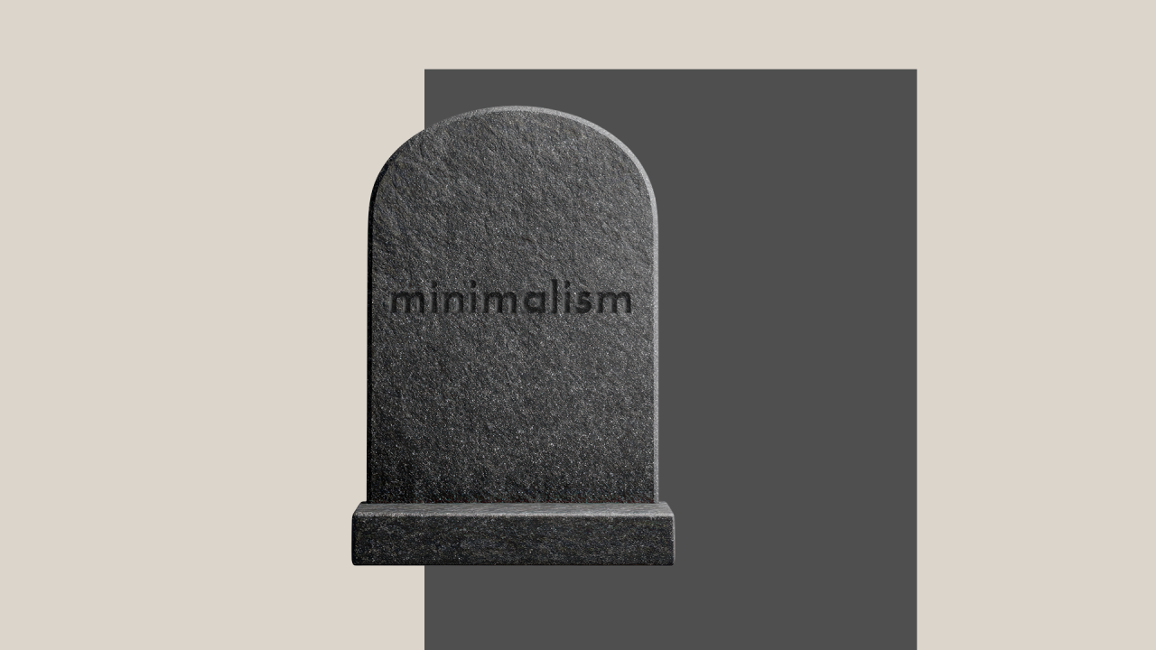
Does Minimalism Still Matter in Design?
That’s something I’ve been thinking about lately. We live in times of overstimulation and visual clutter. When you look at what’s trending for the past few years, you will see maximalist tendencies, but I would argue that the popularity of maximalism doesn’t make minimalism passe.

Brand Loyalty - does it still exist?
On my grandparents dining table, in their kitchen and bathroom, one would always find the same brands, the same packaging. My grandfather smoked a lot, but only Gaulloise cigarettes. My grandma used only Blueband margarine. On the dining table, a standard product used to be Maggi - basically fluid salt.
The Power of Storytelling in Branding
In school, I struggled with history; I could never remember all the dates, and it seemed boring to me. Now, when I think of it, this should be the most interesting subject, but in my experience, most often, it was based on a list of dry facts: no cause, no consequence, no background, no storytelling. So, ironically subject with the most potential has lost my interest forever.

The Queen of All Colours?
Renoir once said “I have been 40 years discovering that the queen of all colours was black”. His ancestors, may thousands years before, might have been among those early creative humans that made the cave paintings in Lascaux, using charcoal as a base for black pigment, alongside other basic colours, like ochre.
Building a Cohesive Corporate Identity - Consistency, Culture, and Connection | part 2
Continuing from our previous exploration into the power of corporate identity, this article delves deeper into how brands evolve, the importance of internal branding, and the role of storytelling in creating emotional connections with your audience. We'll examine how adaptability, employee engagement, and compelling narratives enhance your brand's presence and ensure long-term success.
The Power of Corporate Identity — More Than Just a Logo | part 1
First impressions matter. Whether meeting someone new or encountering a brand for the first time, appearances significantly influence our perceptions. While we shouldn't judge a book solely by its cover, the reality is that the cover often provides the first glimpse into what lies within. This article explores the essence of corporate identity and how it's much more than just a logo — it's the embodiment of a brand's personality through visual and behavioural elements.
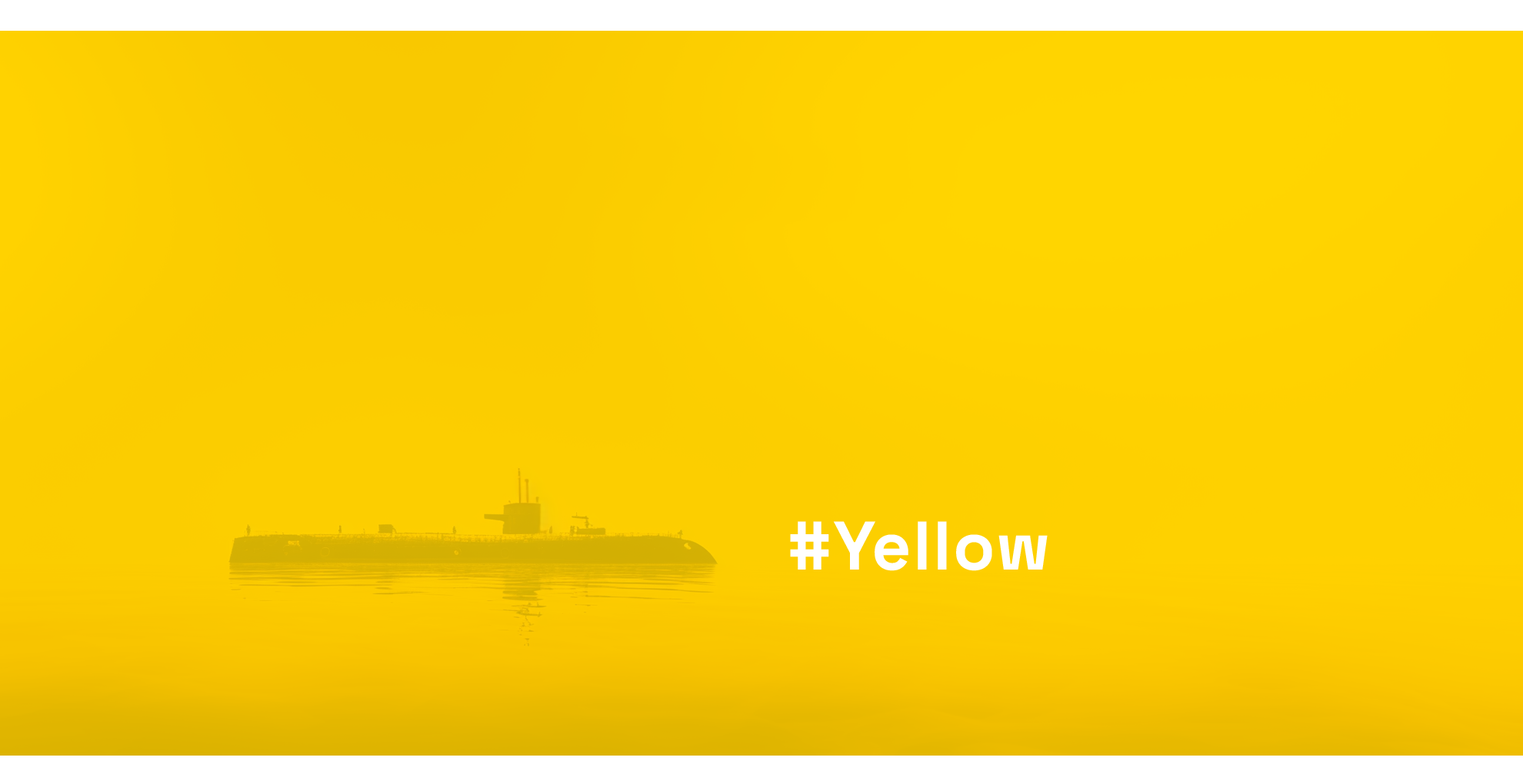
Too Yellow to be Yellow
Yellow is a very bright colour that gives an optimal contrast with black. We all know yellow-black warning signs; the ones for toxic or nuclear waste for instance, are mostly made up of yellow backgrounds with black text and icons. The same colour combination is used for many traffic signs, or the "police" tape used at crime scenes.

White & Bright
If you are Inuit - formerly known as Eskimo - you probably see the colour white a lot. Still, the idea that the Inuit have an exceptionally large number of words for different shades of white is a bit of a linguistic myth; they have many specific terms to describe different snow and ice conditions, which are crucial for survival in their environment. White - we connect it to innocence, virginity, cleanliness, purity. It is neutral, quiet. We like our teeth to be white. We wave a white flag when we want to surrender. And although European cultures chose black as a colour for mourning, in most of Southeastern Asia it is white.

Out of the Blue
A friend of mine tried to sell his four year old Porsche. For a long time. "Nobody will buy it" he concluded "because it is dark blue". Dark blue, until not so long ago the reigning king of financial institutions when it comes to Visual Identification, seems to have lost its appeal. It is a colour that is supposed to express security, knowledge, authority, stability, reliability. Ideal for a bank, it seems, or jeans; maybe not so ideal for a sports-car?
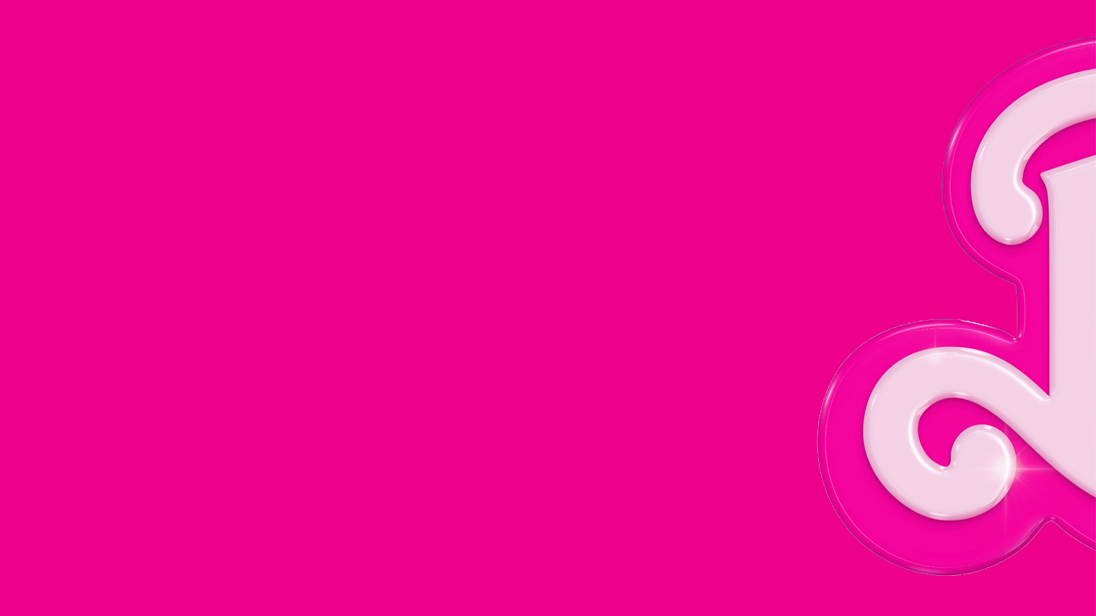
Pink in the Pink
99% Brand awareness world-wide. Very, very few brands have achieved this. When asking some random people which brand we have in mind, they will probably be surprised about the right answer. There could not be any greater hint than the title of this article. Off course we mean the Barbie brand.