


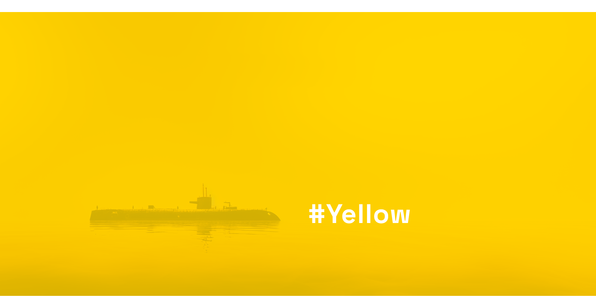
too yellow to be yellow
TOO YELLOW TO BE YELLOW


26/01/2024
Yellow is a very bright colour that gives an optimal contrast with black. We all know yellow-black warning signs; the ones for toxic or nuclear waste for instance, are mostly made up of yellow backgrounds with black text and icons. The same colour combination is used for many traffic signs, or the "police" tape used at crime scenes.
A colour of contrasts
The meaning of and connotations with the colour yellow are also very much contrasting, and could not be more opposite in different regions of the world.
In China, it is seen as associated with wealth and prosperity, but above all, it was the "private" colour of the Chinese emperor. That tradition goes back to the 7th century a.d.; the colour "chihuang" could be used only by the emperor, because he is unique and important as the sun. As stated by the philosopher Confucius (551-479 B.C.), “There cannot be two suns in the sky, nor two emperors on the earth.”
Close to China, in Japan, yellow is a symbol of bravery, nature and sunshine and the Indians see it as the colour of the Hindu god Lord Vishnu, the sun god Surya, and connected to knowledge and wisdom.
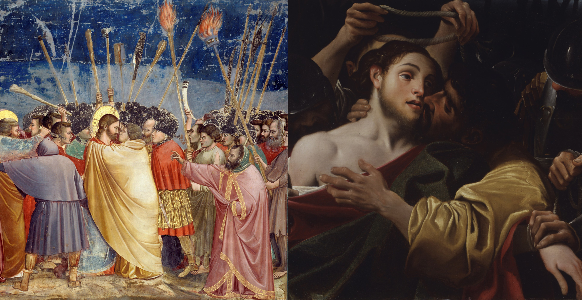
"Judas' Kiss", by Giotto and Carracci: Judas is dressed in yellow. Source: Wikicommons / Google Arts
Judas is Yellow
English dictionaries show us something very, very different: yellow means mean, cowardly, with synonyms as gutless and spineless, unheroic - "He was too yellow to stand up and fight".
Now where did that come from? Most probably from "Yellow-belly", a name for easily frightened, small animals, like some birds and amphibians, that hop or fly away when you approach them. But no one is really sure. Yellow as the colour for lies, adultery, and traitors. Who most often wears yellow clothes in old paintings? Judas! For centuries, Judas, as well as Jewish people - even until the second world war by the Nazi's - were marked with the colour yellow, "because they had betrayed the Lord".
Spanish executioners in the middle-ages where dressed in red - symbolising blood - and yellow - symbolising treason. In France, in the 10th century, home doors of traitors and criminals where painted yellow.

Yellow - more frequently used in interior or fashion design than for corporate identity. Source" Adobe stock
Yellow Brands & Products
Most of us in Europe or the United States are unaware nowadays of any serious negative meanings from earlier times. If so, why so few well-known brands use plain yellow as a lead colour?
Most brands we connect to this colour use it together with red or black. Yellow and black or yellow and red have sharp contrasts, and make your logo stand out and be noticed. Just take a look at Shell, or McDonald's. They needed to be spotted from a long distance, so you would stop your car there to tank petrol or eat a Big Mac. Or rent a car, in case of Hertz.
Still, for any foods or cosmetics logo or packaging, the colour yellow seems a bit too contrasty, shouting, even aggressive, and is not popular among mainstream brands. Even for a bank it seems just too much, with the Raiffeisen logo as 'the exception that proves the rule'. Even when we associate yellow with sunshine, or gold, plain yellow will probably never become a main or popular colour for FMCG products. Or cars. Or clothes, electronics, furniture. It is perhaps just too bright and has only few variations. If you make it a bit lighter, it changes to a pale pastel shade. Make it a bit darker, and it becomes dirty, brownish, orange, or mustard. Surprisingly or maybe even paradoxically, mustard tones are more frequently used than plain yellow, when it comes to fashion or interior design. Many people find it to be a versatile and trendy colour that adds a unique touch to any outfit or room, however, those mustard tones end up last when testing people's favourite colours, most probably because of negative associations with certain body fluids.
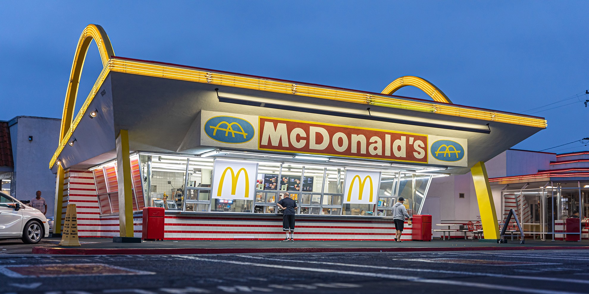
First drive-in McDonald's (1953) in Downey, California. Source: Adobe stock
Not too Yellow to be Yellow
When asking people if they know a company with a yellow logo, there is a big chance that the answer will be McDonald's. The letter "M" is just plain yellow, and the supporting colour red has by now changed to dark green - and in Israel from red to blue for the "kosher" McDonald's. But they even frequently use the "M" symbol on white backgrounds, despite the lack of contrast. Even so, it is easily recognisable, for anyone.
Although many people question the quality and health benefits of their product, they are a company that successfully reacts to any tendencies, and they take radical steps when necessary, like changing their corporate identity - their red background colour - to a colour that is pretty much the opposite.
The Yellow "M" seems untouchable for now. It is their base, their past, their foundation: the very first McDonald's features two yellow arches in the building's structure, that together make up the "M" symbol. The yellow is here to stay.
It is as far as I know the only multinational, known worldwide, with a purely yellow logo. It works well again the sky, or even against a white background. It works with dark green too. They are not afraid of ancient, negative connotations nor are they afraid of change, when their market and target group requires it. McDonald's adapts amazingly fast to trends: marketing-wise, they are definitely not yellow.