


how branding and visual identification compare to bad shoes
HOW BRANDING AND VISUAL IDENTIFICATION COMPARE TO BAD SHOES


19/07/2023
Where does Corporate Identity end and branding start? Branding and Corporate Identity start together, and die together - when a brand disappears.
When we consider the corporate Identity as "the way a brand looks" and branding as "the way a brand is promoted", and although they refer to different aspects of a company's image and marketing strategy, we can already see how closely the two are connected.
hasztag#Corporateidentity encompasses the visual and tangible elements that represent a company and its values. It is the way a company presents itself visually to the world. The corporate identity elements should be designed to create a consistent and coherent visual representation of a company or brand and is supposed to help establish its unique identity.
hasztag#Branding is a somewhat wider concept that goes beyond the visual elements and encompasses emotional and psychological associations people have with a brand or product. Branding is about shaping the perception of a brand in the minds of its target group.

Branding vs Visual Identification
Branding aims to create a strong and positive association with a company, establish its position in the market, differentiate it from competitors, and build customer loyalty and trust. That's the theory, anyway.
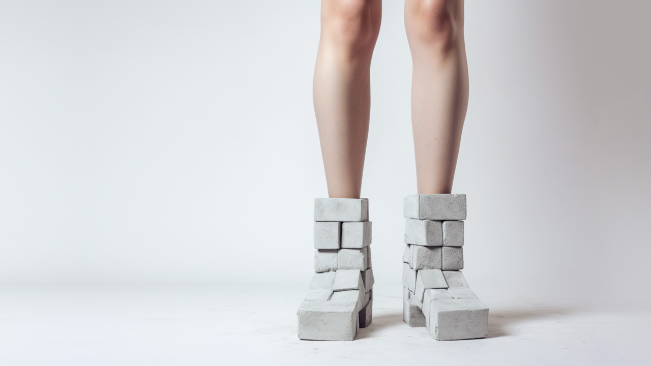
So when promoting a brand in whatever way, most probably you want to create a brand image, and for that you need your basics like a name, logo, colours and typography. Having these wrong is like going on a long walk with very wrong shoes: You can start walking, you will go forward for a while, but your feet will hurt and hurt more until you are forced to slow down or stop your journey. Or change shoes.
Houston, we have a problem
A potential problem is, that the corporate identity gives you a pretty tight grid of what to do or not to do when it comes to the visual side of a brand - but when it comes to branding, there is a lot more flexibility to come up with creative ideas - for better or worse - to promote a brand, advertise it, build an image.
A promotional idea and its execution or a packaging design, can be done following the rules of the corporate identity very strictly, but still have an undesired effect. To give an extreme example, if the corporate identity - or House Style when it concerns smaller companies - gives you certain rules about use of logo, typography and colours, but does not specify what images to use on a packaging, you could theoretically place an image of a dead rabbit under the logo. Which most probably will not do sales or image any good. A silly example, perhaps, but still - there are a lot of 'dead rabbits' on the market.
On the other hand, when the corporate identity is extremely detailed and strict about what is allowed and what is not, it might suffocate any creative ideas in the cradle.

In 2011 I encountered the most strict corporate identity I've ever seen: Union Investment. Made in Germany - Ordnung muss sein! There was so much Ordnung, they even gave an exact description of the kind of images that could be used; tone, character, composition. It made perfect sense for a big, established financial institution. They made sure they played safe. But when the brand had to be promoted on the Polish market the corporate identity rules turned out to be so restricted, that we could not create the advertising campaign that was needed. So the corporate identity was literally compromised: all of the planned items for the campaign had to be sent to the German headquarters for approval - they had to agree to exemptions.
I chose the example of 'bad shoes' to show potential complications with corporate identities, but when I had to choose some kind of metaphor for corporate identity and Branding acting together, I would go for two prisoners, cuffed together, and trying to escape. If they work together in harmony, they could succeed. If one of them is weak or disagrees with the other, the escape will fail.
Wrestling competitors
Let's return to the metaphor of the shoes. Even if you chose the right shoes, they might wear out over time or start looking old fashioned. They will affect your image. You will be amazed how often we are dealing with 'bad shoes' at Fynk. Often, brand's management have no clue about the implications of a bad
hasztag#logo,
hasztag#CorporateDesign or
hasztag#Brandbook. Just take a look at successful brands like Coca-Cola and Nike versus Pepsi Cola and Reebok. The last two have been struggling with their logo's for decades, and in despair have even returned to logotypes from many years ago.

Coca-Cola logo, 1893

Pepsi Cola logo, 1898
I don't think Coca-Cola or Nike will even have to facelift their basic logotype. It is perfect, and if you change something that is perfect, it is no longer perfect.
If you look at the initial Coca-Cola logo and the first one for Pepsi-Cola - both were designed by non-designers by the way - we notice that Pepsi got off on the wrong foot. It took Pepsi 70 years to come up with a really good logo, which they abandoned in 1991 in favour of a serie of mediocre designs, only to return to pretty much the 1973 version in 2023!
In terms of image, when Coca-Cola invented the beautiful 'Mae West' bottle more than a century ago, Pepsi got stuck with something that looked like a ketchup container.
For decades, Coca-Cola was like the U.S. President and Pepsi the Vice-President. And when Pepsi finally had nearly everything right in the 1970's, they changed the logo they revived today, and changed their advertising campaigns into negative messages about their biggest competitor. In those years, Coca-Cola refreshed us with dynamic and positive lifestyle ads.
Did Pepsico achieve any successes lately? Yes! Sales went up in those countries where Coca-Cola recently pulled out.
Ree who?
We all know Reebok, although most of us would prefer Nike, Adidas, or Puma. Reebok has been around for a long time, from the U.K., since 1958. They started off with a logo that seemed to show either a tanga slip or a funnel - it's difficult to say.
In the 1990's the logo 'as we know it' appeared until it disappeared in 2015 and reappeared in 2019. What happened in those five years, during which they changed logo, strategy and image? They lost a lot of money.

[source: underconsideration.com]
Oh, what a great idea they had in 2014. They changed a fairly dynamic logo into a static one, that looked like a logo for a cement-factory, and focused on fitness featuring professional athletes. Thereby alienating the bulk of potential clients that just wants cool stuff from a sportive brand; cool good-looking stuff with cool good-looking advertising and a cool good-looking logo.
It took them five years to wake up, return to their previous logo and shift to cool good-looking advertising. No more professional athletes, but active young people that built a happy, emotional, dynamic and positive brand image. Way to go Reebok. What took you so long? And guess what, they even seem to be making a profit again.

Save a dime, loose a buck
Preparing your Corporate Identity or Brand-book in the right way means a proper preparation for any further branding process. Neglecting this part results in a.o. logo or packaging design that limits sales and hurts image; things that are costly to fix. You save a dime only to do damage worth a buck.
Lots of companies do not have budgets to engage fancy, expensive branding agencies. Those agencies, by the way, will surely come up with something expensive, but not necessarily with something effective. In the end, it all comes done to the level of professionalism of the client - they are the ones with the final saying of what will be implemented. Which means that no matter what kind of branding agency you choose, as a client you can steer what the agency will come up with.
But we live in times where everything is supposed to be fast and cheap, and has to be replaced soon because it turns out to be no good, no longer in fashion, or broken. We see that trend everywhere: in the car industry, domestic appliances, fashion.
The design and branding business is no exception. This is no excuse to neglect the very basics of the process of ultimately selling a product; to treat the looks and impact of design as something of secondary importance. There a dozens of examples where millions were poured into unsuccessful advertising campaigns, because the foundations were wrong.
You just can't win a marathon on bad shoes.