


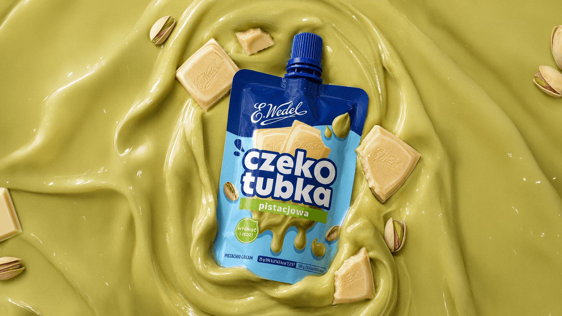
E.Wedel Czekotubka
Client
E.Wedel
Scoop of work
Packaging
Country
Poland
Czekotubka is E.Wedel's liquid, creamy snack within arm's reach — a product with its own fans, its own place on the shelf, and its own character. The previous design was clear and recognizable, but the brand decided it was time to root it more firmly in the world of E.Wedel: a world full of chocolate pleasure, quality, and details that consumers have recognized for years.
The natural next step was to turn attention to Wedel's iconic chocolate cubes. They became one of the main elements of the new composition, building a stronger association with the brand and giving the packaging an even more appetizing character. We also refreshed the Czekotubka logo, preserving its key traits: simplicity, clarity, and a strong presence on the shelf, while giving it more individuality.
"We were looking for a partner who would understand the brand's unique DNA while also bringing freshness and a modern perspective. Our collaboration with the FYNK agency was, from the very start, one of partnership, creativity, and engagement."
— Aleksandra Łukasik, Junior Brand Manager, Lotte Wedel
The natural next step was to turn attention to Wedel's iconic chocolate cubes. They became one of the main elements of the new composition, building a stronger association with the brand and giving the packaging an even more appetizing character. We also refreshed the Czekotubka logo, preserving its key traits: simplicity, clarity, and a strong presence on the shelf, while giving it more individuality.
"We were looking for a partner who would understand the brand's unique DNA while also bringing freshness and a modern perspective. Our collaboration with the FYNK agency was, from the very start, one of partnership, creativity, and engagement."
— Aleksandra Łukasik, Junior Brand Manager, Lotte Wedel
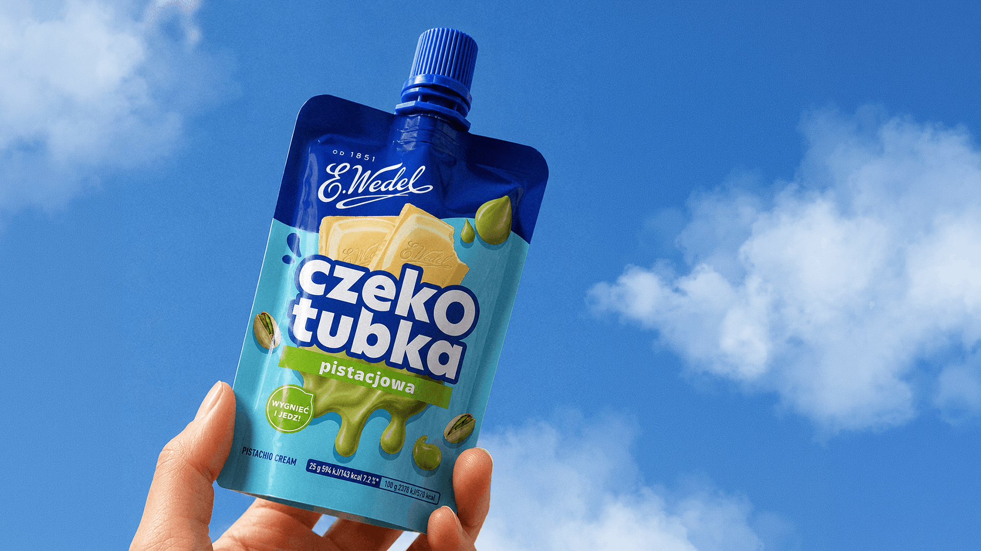
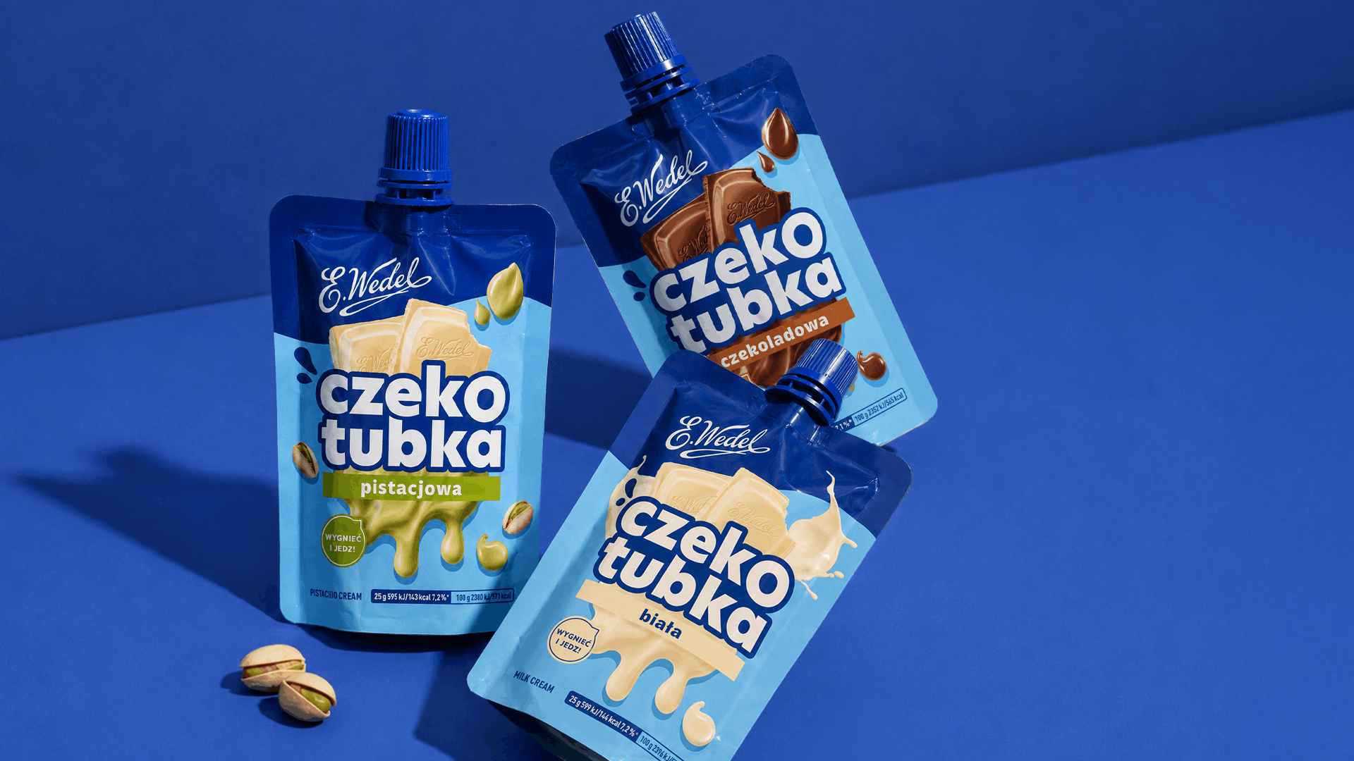
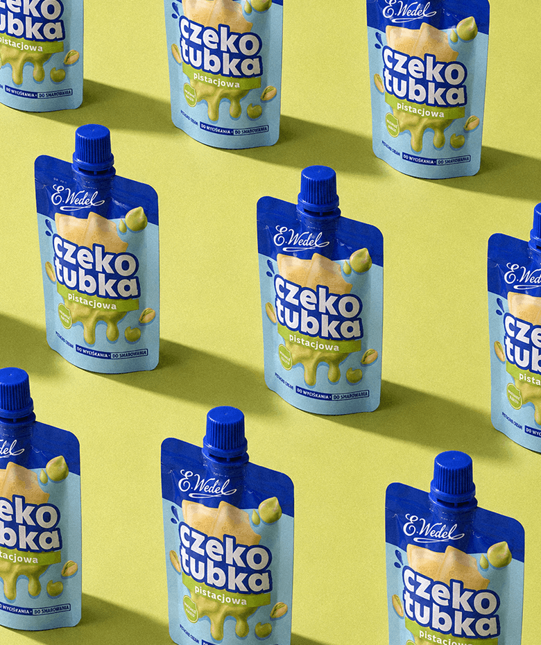
The result? A more "Wedel," more appetizing, and even more modern Czekotubka. Still recognizable, but with a much bigger appetite for the consumer's attention.
SEE OTHER PROJECTS
FROM OUR PORTFOLIO
Contact us 

Branding
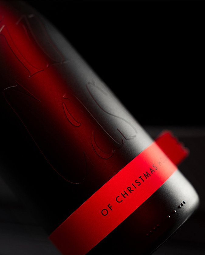
Wine In Case
On par with great taste, versatile, elegant packaging is extremely important.
Branding
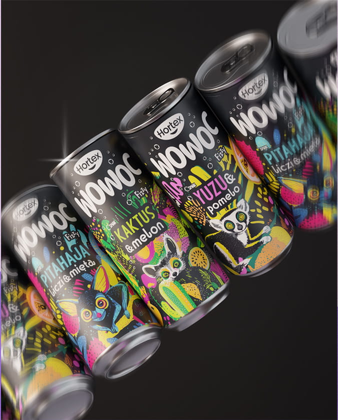
Hortex Wowoc
A wild, psychedelic composition with layered artwork full of cacti, fruit, and exotic animals that communicate what's worth trying.
Do you like it?
Call US
+ 48 12 222 00 80
Or write to us!
office@fynk.eu
Contact Us Contact Us Contact Us