


Hortex Wowoc
Client
Hortex
Scoop of work
Packaging
Country
Poland
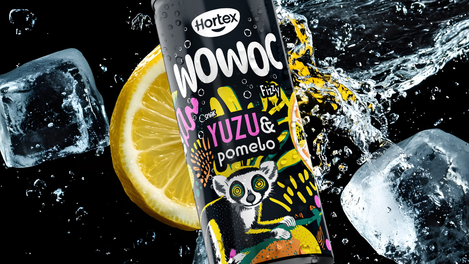
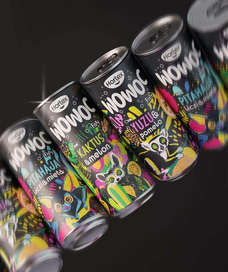
Wowoc is a carbonated fruit drink created for the Hortex brand — one of the most recognizable Polish food brands — for which we undertook the creation of a new product line aimed at a young audience. In this project, we wanted to break away from the idyllic world of classic Hortex and step into territory that is bold, urban, and full of energy.
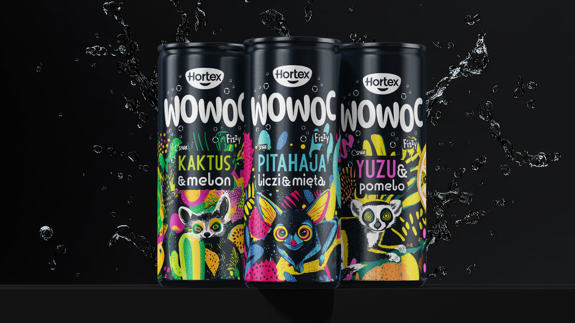
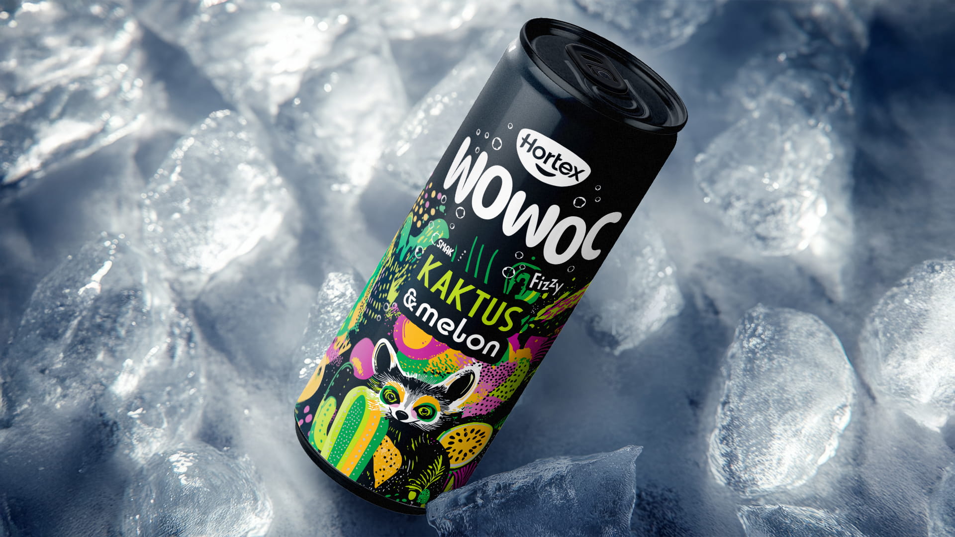
The final concept is based on a deep, matte black can, which serves as the perfect canvas for the illustration exploding across the label. The wild, psychedelic composition combines neon greens, yellows, and fuchsias with dense, layered artwork full of cacti, fruit, and exotic animals.
The WOWOC typography — bold, white, almost loud — cuts through the graphic chaos with absolute confidence, while the striking flavor names round out a narrative full of character. The overall packaging communicates something unexpected, something worth trying.
The final concept is based on a deep, matte black can, which serves as the perfect canvas for the illustration exploding across the label. The wild, psychedelic composition combines neon greens, yellows, and fuchsias with dense, layered artwork full of cacti, fruit, and exotic animals.
The WOWOC typography — bold, white, almost loud — cuts through the graphic chaos with absolute confidence, while the striking flavor names round out a narrative full of character. The overall packaging communicates something unexpected, something worth trying.
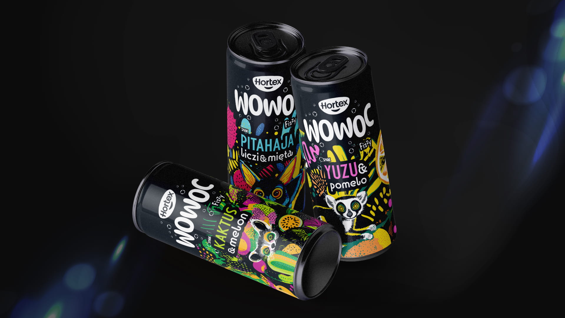
We believe packaging should stop the eye before the product gets a chance to speak through taste. That's why every element of the Wowoc label was designed to shout louder than everything else on the store shelf.
SEE OTHER PROJECTS
FROM OUR PORTFOLIO
Contact us 

Packaging
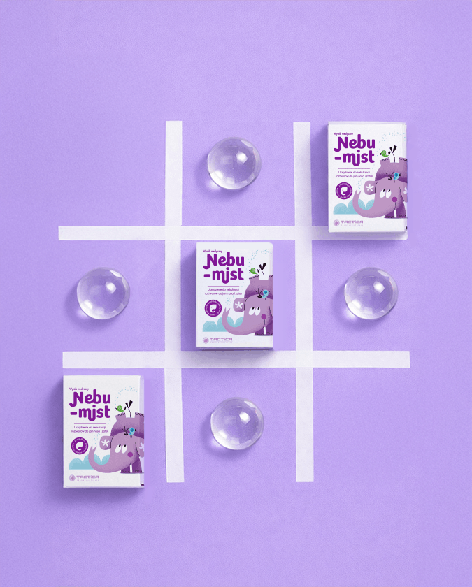
Nebumist
Opakowanie, które mówi jednocześnie do dziecka i do rodzica - budzi zaufanie, a zarazem sprawia, że mały pacjent sięga po nie bez oporu.
Do you like it?
Call US
+ 48 12 222 00 80
Or write to us!
office@fynk.eu
Contact Us Contact Us Contact Us