


Mochi
Client
Soti Natural
Work
Packaging
Country
Poland
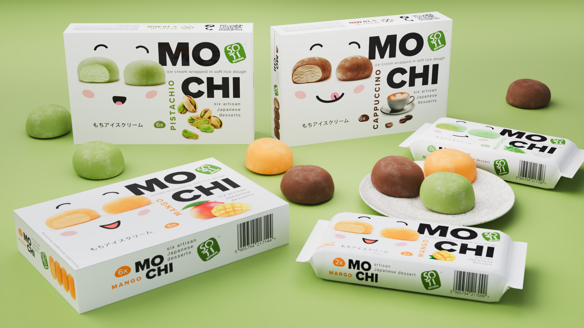
The presented mochi ice cream packaging is designed in a style that combines minimalism with playful graphic elements - emoji. Each package has a clean, light background and a primary color corresponding to the flavor of the ice cream inside – for example, yellow for mango, green for pistachio. On the front of the packaging are large, friendly illustrations of mochi with faces, adding character and charm to the packaging. The design is simple but effectively attracts attention, blending contemporary design aesthetics with elements of Japanese culture. Product information is easily accessible and readable, making it easy for consumers to identify and choose.
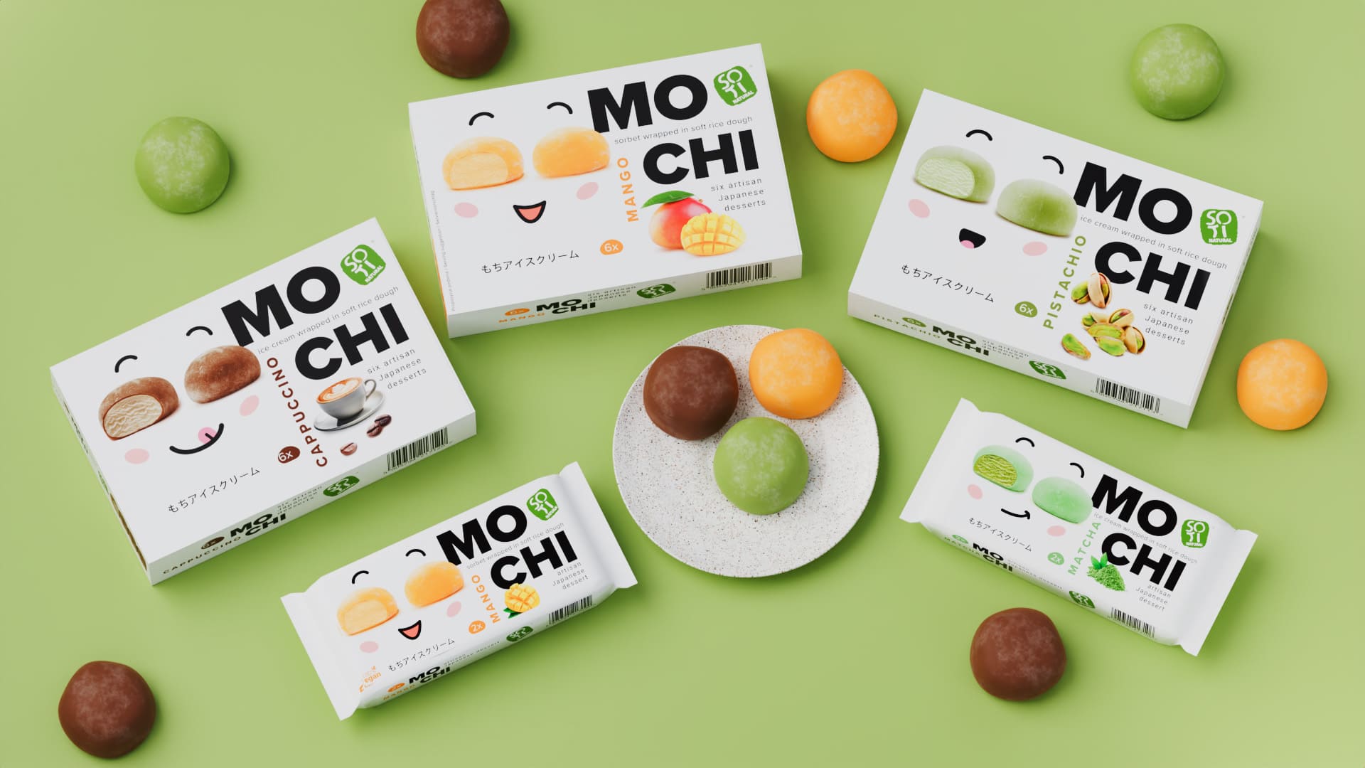
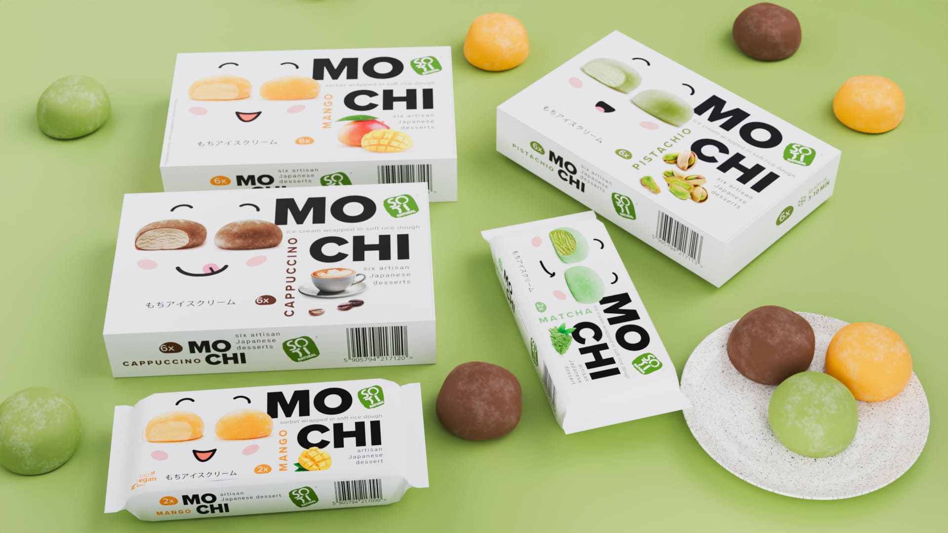
The design of the mochi ice cream packaging is fun and appealing, with minimalist illustrations of smiling faces, bright colors and clear labels that highlight the taste and quality of the product.

SEE OTHER PROJECTS
FROM OUR PORTFOLIO
Contact us 
Do you like it?
Call US
+ 48 12 222 00 80
Or write to us!
office@fynk.eu
Contact Us Contact Us Contact Us