


what makes a good logo design?
WHAT MAKES A GOOD LOGO DESIGN?


16/09/2026
“Can you make the logo bigger?” – one of the most common pieces of client feedback, suggesting that they are proud of their brand and what its logo represents.
The truth is, if a logo is well designed, it does not need to be made bigger. It should be legible, appealing to its audience, and reflect the brand's character. It will appear across all marketing materials, products, stationery, and business cards. That is why visual identity projects are perhaps the most important assignments we undertake.
Interestingly, logo design does not always focus solely on the brand itself. Often, a logo is created for a specific product line and needs to coexist with the master brand logo. We should not forget rebranding and brand refresh projects either. Beyond giving a brand a fresh look, they still need to remain recognisable and often retain elements of its original character. Sometimes, this can be more challenging than designing a logo from scratch.
We begin creating a new brand logo by defining the context in which it will operate. It is key to identify the target audience, market, and competition, as well as the message the brand should convey and how it should be perceived. Only after thoroughly exploring the brief do we move on to the visual design stage.

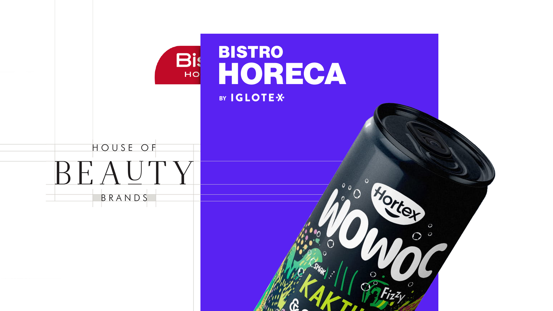
When our long-standing client Bielenda asked us to create a visual identity for a brand bringing together all the company’s brands, we faced the challenge of designing the House of Beauty Brands logo.
The design needed to be simple, timeless, and recognisable. With this in mind, we focused on refined, almost architecturally precise typography in classic black. To give the universal design a distinctive touch, we underlined the letter “u” as a symbol of beauty. This subtle treatment added individuality while maintaining the brand’s elegant character.

Our portfolio also includes another project bringing together multiple beauty brands – this time Korean ones – Seul Skin. Comparing these two examples reveals two different approaches shaped by different target audiences, despite the same industry and a similar purpose.
For the Seul Skin logo, the aim was to present the brand as innovative and trend-conscious. Here, too, we based the design on typography, but the key differences lay in the choice of typeface, which feels younger and more expressive, as well as in the trendy colour palette.
This project also showcases that a logo is not simply a single symbol, but an entire system of marks adapted to different formats. If you are interested in the Seul Skin project, we break it down in detail in this article.

A subtle example of going beyond the logo itself is the branding project we created for The Kochmanski Company. In this case, the logo is also typography-based, but we enhanced it with small graphic details. These add context to the company’s offering – vegan products – which is further reinforced by the choice of colour palette.
The logo also needed to work effectively on small packaging, demonstrating just how important scalability is when designing a logo.
Sometimes, we become involved in a project before the brand has even been named. In these cases, we guide the client through the entire process of building a brand from scratch.
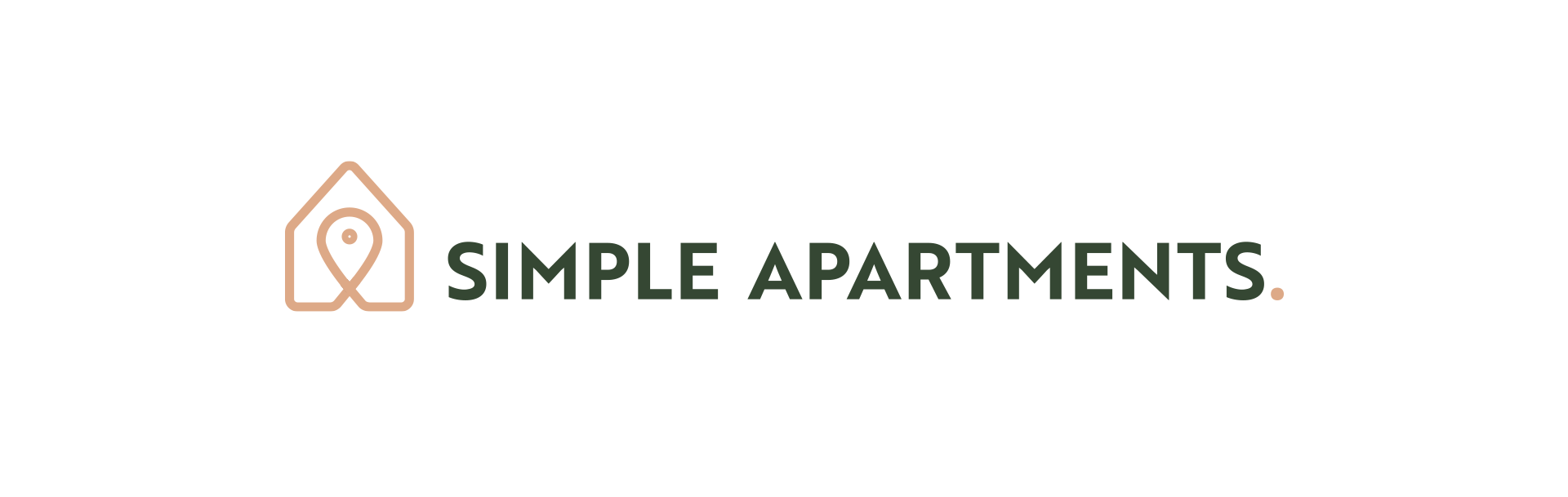
This was the case with Simple Apartments. From a selection of names we proposed, the client chose this one, and simplicity became the defining factor for the visual identity. The logo combines a minimalist symbol based on a house and a location pin with simple typography and a carefully selected colour palette. Together, these elements create a cohesive brand image and clearly communicate its values.
Product logo design is discussed less frequently, yet it serves a somewhat different purpose.
Firstly, the design needs to work alongside the existing master brand logo. The two are often positioned very close to one another. It is also important to remember that a product logo will not appear exclusively on the product itself. It will be reproduced alongside the key visual across promotional materials of different sizes and formats – from social media posts to billboards and POS materials.
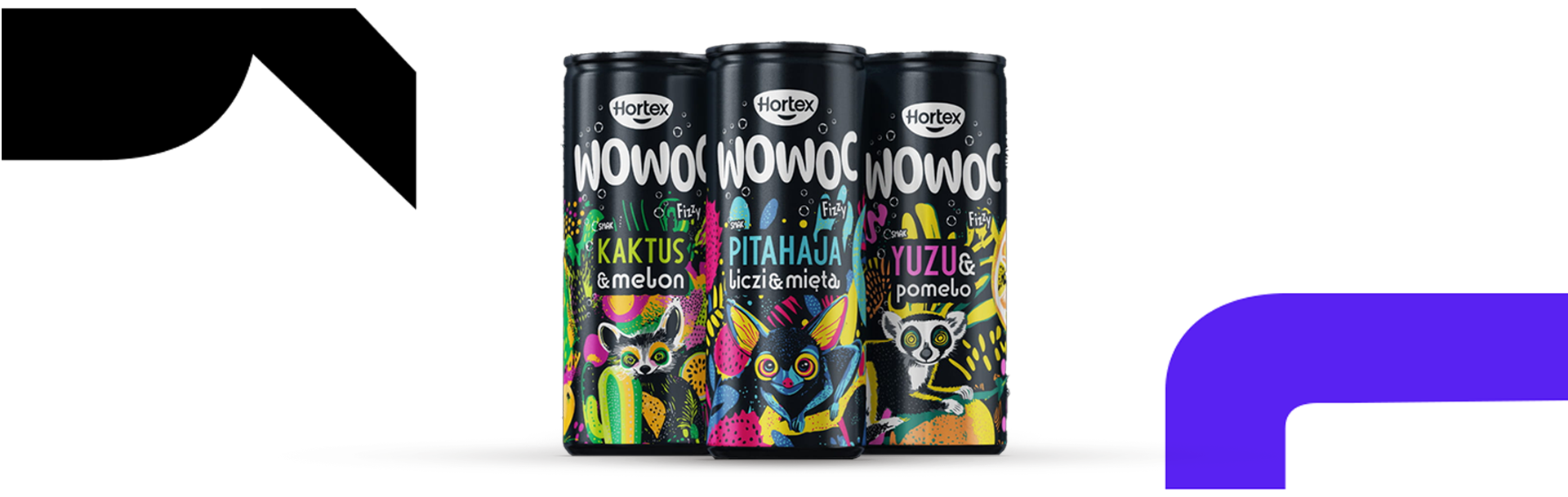
When designing WOWOC drinks for Hortex, we paid particular attention to the logo’s scalability and adaptability – not only across different formats, but also across a broader product range.
To make the logo easier to use on multicoloured packaging, we kept it white, making it highly versatile while creating a strong contrast against the packaging’s black background.
In this case, the brand was entering a new market segment aimed at a younger audience, so we created a bold design. To make the product logo stand out even further, we used strong typography with slightly inflated, rounded forms. This gives it a friendlier character, while its substantial weight ensures it remains distinctive.
On the packaging, we successfully combine the master brand logo with the product logo by using monochrome versions of both marks and maintaining a clear information hierarchy through the appropriate scaling of each element.
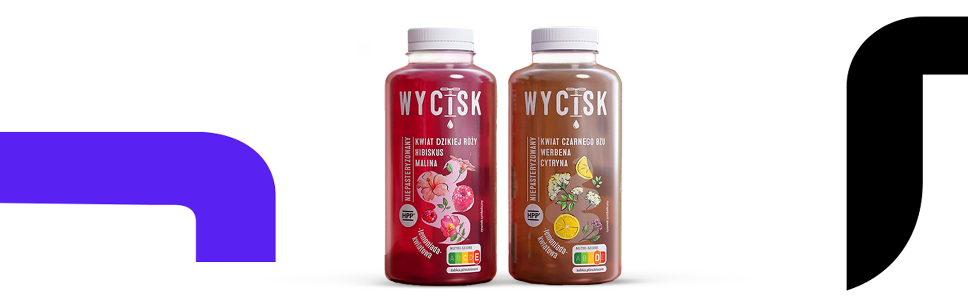
A product logo does not always have to appear alongside the master brand logo. This was the case with another drinks range we designed – Wycisk.
Here, too, the logo was based on bold white lettering. However, by using a simple, uniform typeface and replacing the letter “I” with a graphic element, we achieved a completely different effect, messaging the product’s healthy, fresh character.
The logo is consistent with the wider design system, which is based on typography and simple forms paired with delicate illustrations. Together, these elements create an elegant, minimalist product range designed for the Żabka retail chain.
In a successful rebranding project, the most important consideration is which elements of the existing design to retain and how the new design should reflect the brand's character.
Sometimes, small changes are enough to refresh a company’s image. Other times, brand evolution requires more decisive action. To position a project appropriately on the spectrum between a full rebrand and a brand refresh, a strong brief and effective communication with the client are essential.
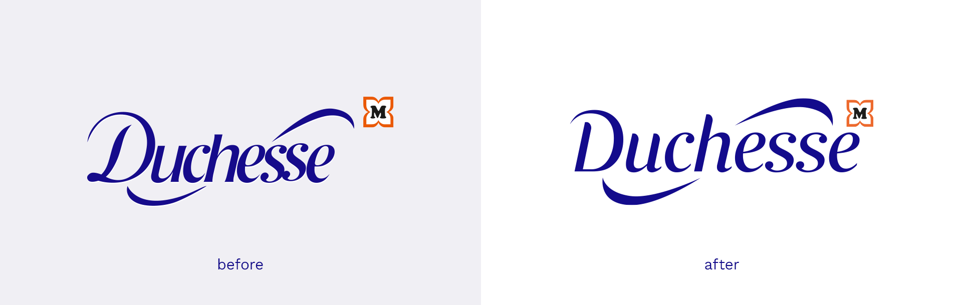
As part of a comprehensive rebranding project for Duchesse, we also refreshed its existing logo.
We improved the mark’s legibility by introducing new typography with increased letter spacing, removed the outer glow from the lettering, and refined the positioning of the distinctive arches in relation to the rest of the composition and the Müller logo.
On the packaging, we significantly increased the logo’s size and placed it on a contrasting white panel. Refreshing the logo’s appearance gave us a strong foundation for further packaging work following the same direction.
This example illustrates the importance of the context in which a brand identity needs to function. The refreshed logo had to work across an extensive and diverse range of products and sub-brands, including Duchesse MED and Duchesse diskret. At the same time, it belonged to a wider brand ecosystem, which meant we also had to work within guidelines governing the protected area around the Müller “M” mark.
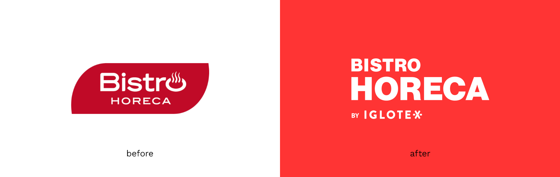
Refreshing a brand is one of the most common reasons for a logo’s redesign, and this was also the case in our collaboration with Iglotex and the redesign of Bistro Horeca.
The changes in this project were more substantial, as the objective was not only to update the design but also to give the brand a more professional character. To achieve this, we introduced a strategic hierarchy of elements and simplified the typography. At the same time, we updated the colour palette to make it more distinctive.
A good logo should work for the brand, building recognition and creating a cohesive foundation for the entire visual identity.
As an agency, we have extensive experience in this area. Whatever the starting point, we always create distinctive designs that strengthen brands, combining strategic thinking with close collaboration with our clients.
If you are planning to launch a new brand or product range, or would like to refresh your company’s image, let’s talk about how we can help.
The truth is, if a logo is well designed, it does not need to be made bigger. It should be legible, appealing to its audience, and reflect the brand's character. It will appear across all marketing materials, products, stationery, and business cards. That is why visual identity projects are perhaps the most important assignments we undertake.
Interestingly, logo design does not always focus solely on the brand itself. Often, a logo is created for a specific product line and needs to coexist with the master brand logo. We should not forget rebranding and brand refresh projects either. Beyond giving a brand a fresh look, they still need to remain recognisable and often retain elements of its original character. Sometimes, this can be more challenging than designing a logo from scratch.
How do you design a logo for a brand?
We begin creating a new brand logo by defining the context in which it will operate. It is key to identify the target audience, market, and competition, as well as the message the brand should convey and how it should be perceived. Only after thoroughly exploring the brief do we move on to the visual design stage.
When our long-standing client Bielenda asked us to create a visual identity for a brand bringing together all the company’s brands, we faced the challenge of designing the House of Beauty Brands logo.
The design needed to be simple, timeless, and recognisable. With this in mind, we focused on refined, almost architecturally precise typography in classic black. To give the universal design a distinctive touch, we underlined the letter “u” as a symbol of beauty. This subtle treatment added individuality while maintaining the brand’s elegant character.
Our portfolio also includes another project bringing together multiple beauty brands – this time Korean ones – Seul Skin. Comparing these two examples reveals two different approaches shaped by different target audiences, despite the same industry and a similar purpose.
For the Seul Skin logo, the aim was to present the brand as innovative and trend-conscious. Here, too, we based the design on typography, but the key differences lay in the choice of typeface, which feels younger and more expressive, as well as in the trendy colour palette.
This project also showcases that a logo is not simply a single symbol, but an entire system of marks adapted to different formats. If you are interested in the Seul Skin project, we break it down in detail in this article.
A subtle example of going beyond the logo itself is the branding project we created for The Kochmanski Company. In this case, the logo is also typography-based, but we enhanced it with small graphic details. These add context to the company’s offering – vegan products – which is further reinforced by the choice of colour palette.
The logo also needed to work effectively on small packaging, demonstrating just how important scalability is when designing a logo.
Sometimes, we become involved in a project before the brand has even been named. In these cases, we guide the client through the entire process of building a brand from scratch.
This was the case with Simple Apartments. From a selection of names we proposed, the client chose this one, and simplicity became the defining factor for the visual identity. The logo combines a minimalist symbol based on a house and a location pin with simple typography and a carefully selected colour palette. Together, these elements create a cohesive brand image and clearly communicate its values.
How do you design a logo for a product?
Product logo design is discussed less frequently, yet it serves a somewhat different purpose.
Firstly, the design needs to work alongside the existing master brand logo. The two are often positioned very close to one another. It is also important to remember that a product logo will not appear exclusively on the product itself. It will be reproduced alongside the key visual across promotional materials of different sizes and formats – from social media posts to billboards and POS materials.
When designing WOWOC drinks for Hortex, we paid particular attention to the logo’s scalability and adaptability – not only across different formats, but also across a broader product range.
To make the logo easier to use on multicoloured packaging, we kept it white, making it highly versatile while creating a strong contrast against the packaging’s black background.
In this case, the brand was entering a new market segment aimed at a younger audience, so we created a bold design. To make the product logo stand out even further, we used strong typography with slightly inflated, rounded forms. This gives it a friendlier character, while its substantial weight ensures it remains distinctive.
On the packaging, we successfully combine the master brand logo with the product logo by using monochrome versions of both marks and maintaining a clear information hierarchy through the appropriate scaling of each element.
A product logo does not always have to appear alongside the master brand logo. This was the case with another drinks range we designed – Wycisk.
Here, too, the logo was based on bold white lettering. However, by using a simple, uniform typeface and replacing the letter “I” with a graphic element, we achieved a completely different effect, messaging the product’s healthy, fresh character.
The logo is consistent with the wider design system, which is based on typography and simple forms paired with delicate illustrations. Together, these elements create an elegant, minimalist product range designed for the Żabka retail chain.
How do you create a successful rebrand?
In a successful rebranding project, the most important consideration is which elements of the existing design to retain and how the new design should reflect the brand's character.
Sometimes, small changes are enough to refresh a company’s image. Other times, brand evolution requires more decisive action. To position a project appropriately on the spectrum between a full rebrand and a brand refresh, a strong brief and effective communication with the client are essential.
As part of a comprehensive rebranding project for Duchesse, we also refreshed its existing logo.
We improved the mark’s legibility by introducing new typography with increased letter spacing, removed the outer glow from the lettering, and refined the positioning of the distinctive arches in relation to the rest of the composition and the Müller logo.
On the packaging, we significantly increased the logo’s size and placed it on a contrasting white panel. Refreshing the logo’s appearance gave us a strong foundation for further packaging work following the same direction.
This example illustrates the importance of the context in which a brand identity needs to function. The refreshed logo had to work across an extensive and diverse range of products and sub-brands, including Duchesse MED and Duchesse diskret. At the same time, it belonged to a wider brand ecosystem, which meant we also had to work within guidelines governing the protected area around the Müller “M” mark.
Refreshing a brand is one of the most common reasons for a logo’s redesign, and this was also the case in our collaboration with Iglotex and the redesign of Bistro Horeca.
The changes in this project were more substantial, as the objective was not only to update the design but also to give the brand a more professional character. To achieve this, we introduced a strategic hierarchy of elements and simplified the typography. At the same time, we updated the colour palette to make it more distinctive.
A good logo should work for the brand, building recognition and creating a cohesive foundation for the entire visual identity.
As an agency, we have extensive experience in this area. Whatever the starting point, we always create distinctive designs that strengthen brands, combining strategic thinking with close collaboration with our clients.
If you are planning to launch a new brand or product range, or would like to refresh your company’s image, let’s talk about how we can help.