


Kogootek
Client
Kogoot
Work
Branding & Packaging
Country
Poland
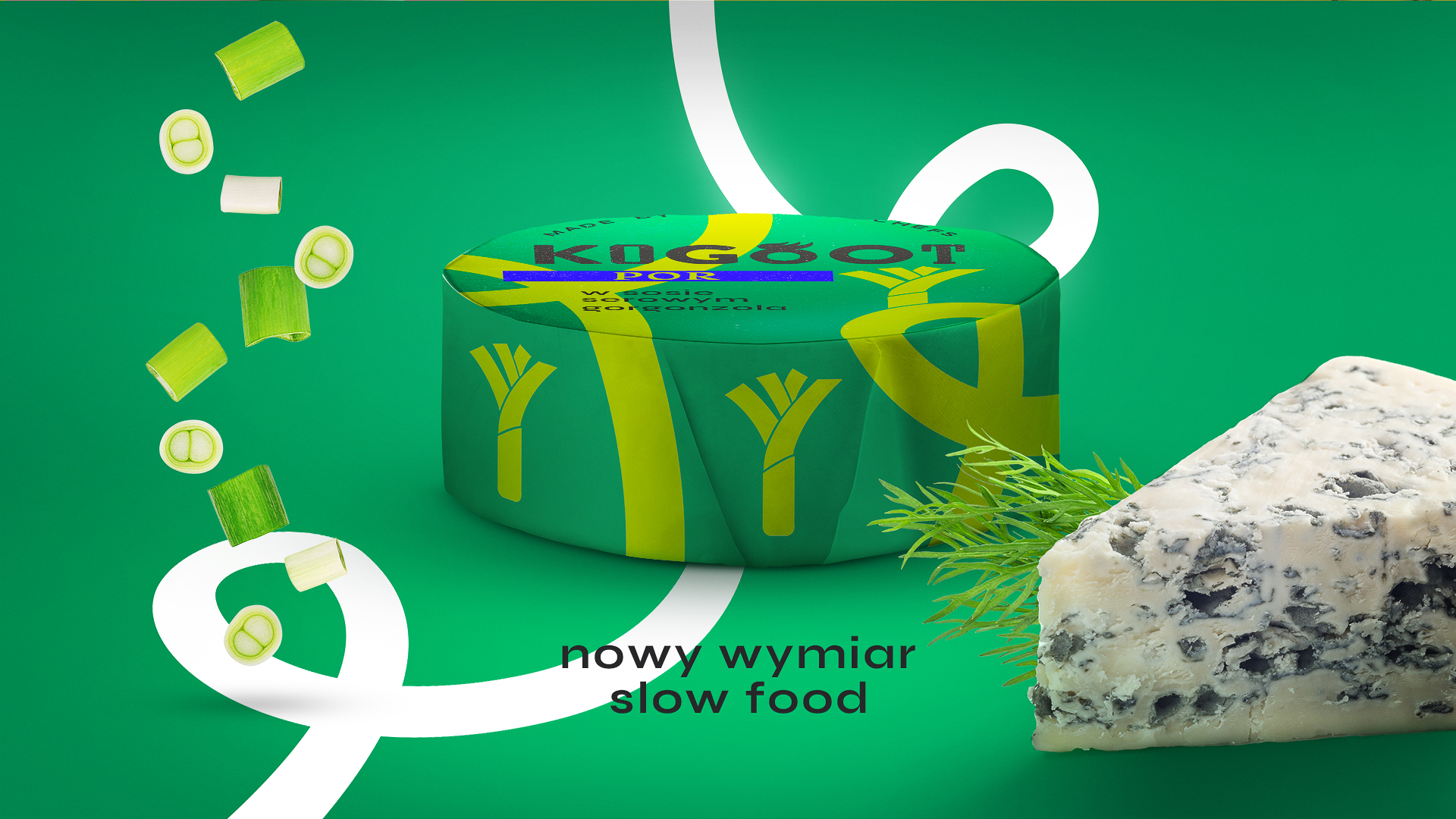
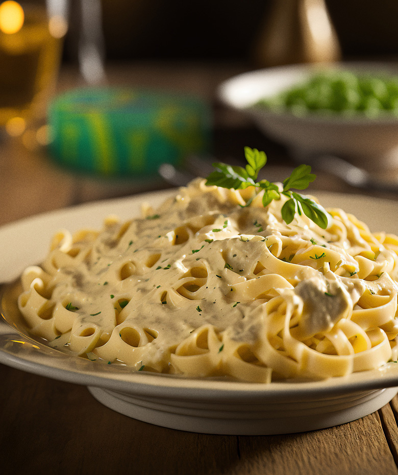
For us, the Kogoot brand project meant not only redefining the can itself, but also the belief that canned food is an invention from the distant communist era, almost always meaning poor quality. With this project, we faced the challenge of building consumer awareness that it is possible to encapsulate an exceptional restaurant meal in the simple form of an ordinary can, where both the design of the packaging and its contents will offer a feast for the senses. The color scheme for the wide range of these products was based on strong, contrasting, saturated colors, the idea of which is to make the dish quickly, almost subconsciously recognized by the hungry consumer.
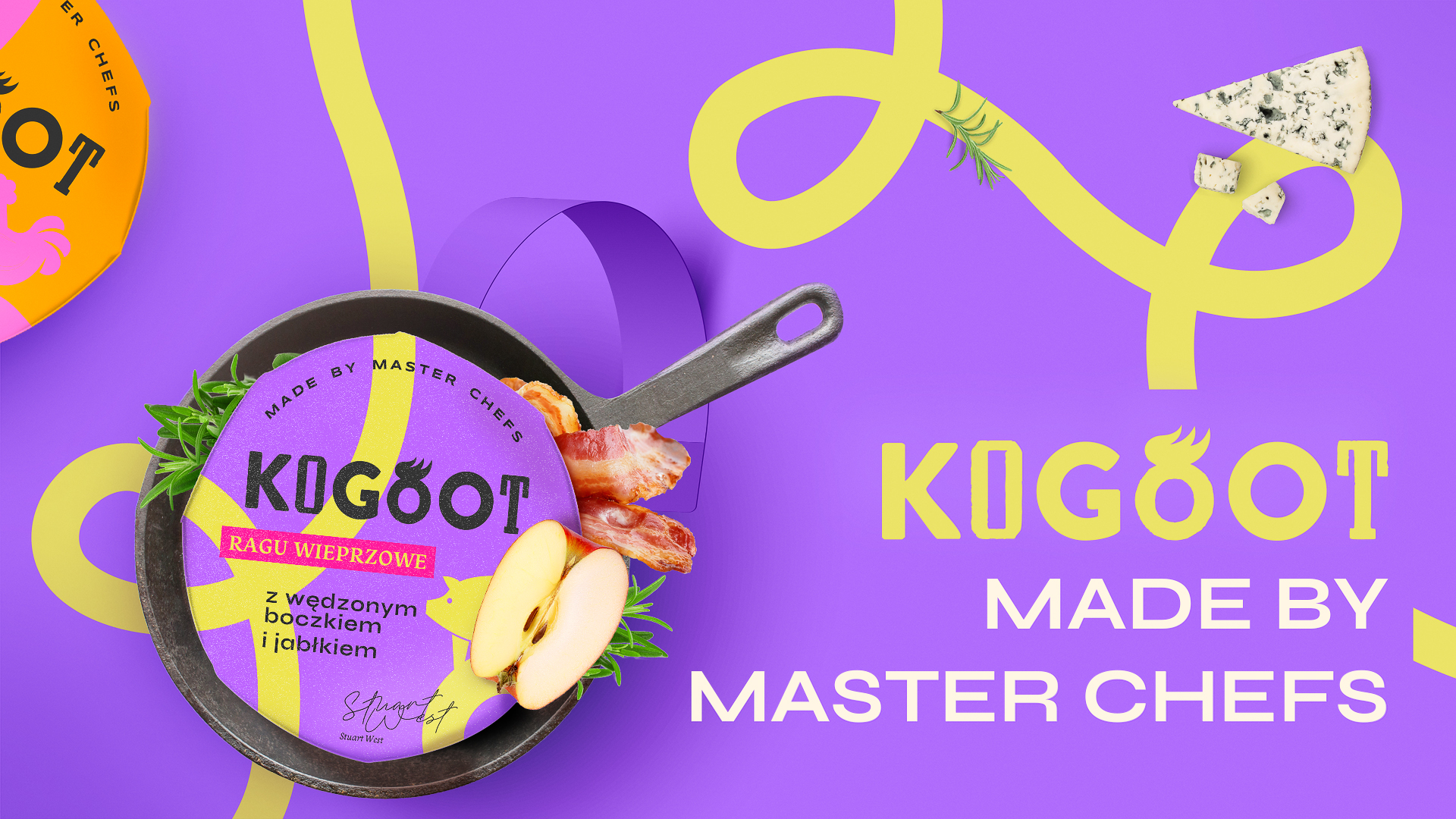
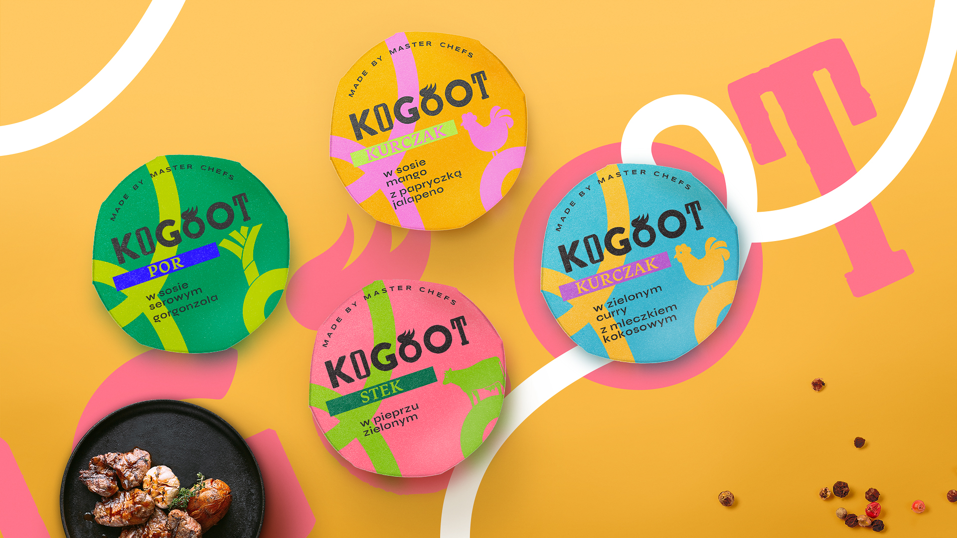
In addition, simple. paper packaging distinguished by a strong color provides the basis for excellent navigation between the introduced products.
SEE OTHER PROJECTS
FROM OUR PORTFOLIO
Contact us 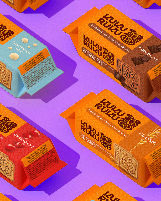
Branding
Kuku Ruku
The design of the Kuku Ruku is a combination of the traditional rooster symbol with modern, clear fonts and an appetizing photo.
Do you like it?
Call US
+ 48 12 222 00 80
Or write to us!
office@fynk.eu
Contact Us Contact Us Contact Us