


House Of Beauty Brands
Client
Bielenda
Work
Visual identity
Country
Poland
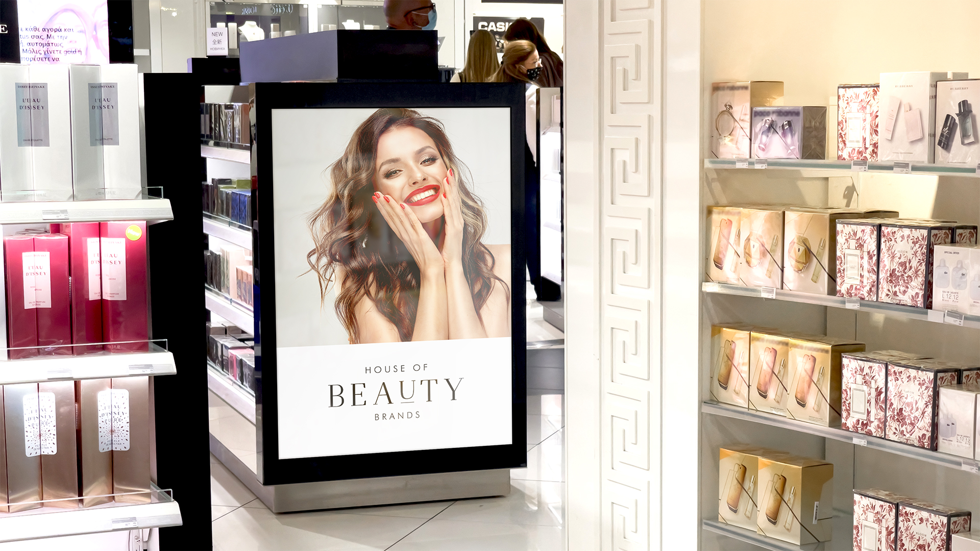
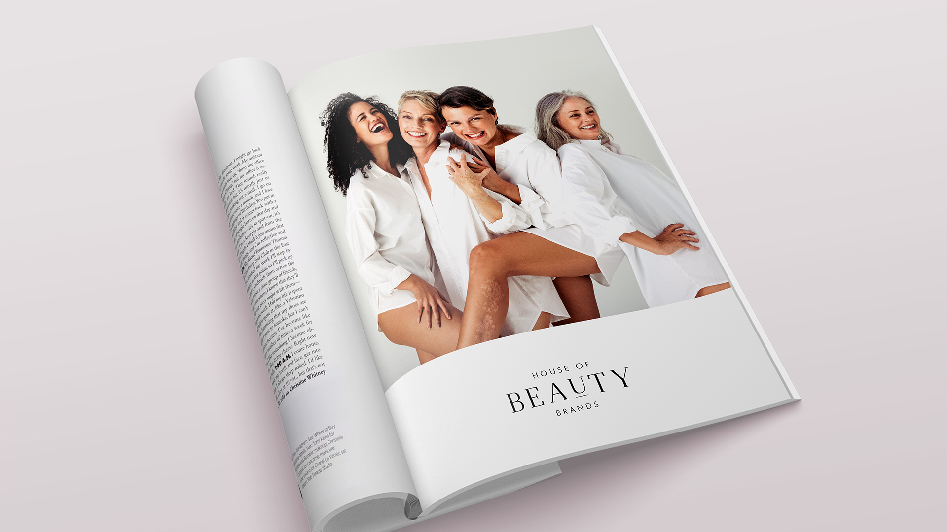
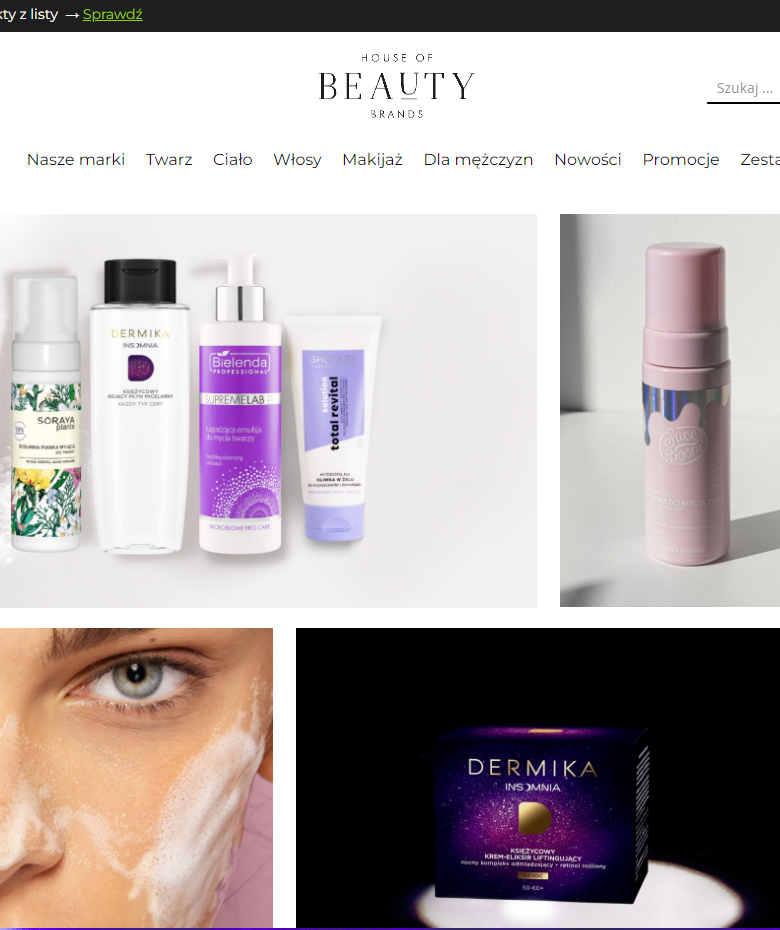
Bielenda - a long-standing client, has once again placed its trust in us by commissioning us to design such an essential element for the company's development, which is the visual identity along with the logotype for the brand combining all Bielenda trademarks.
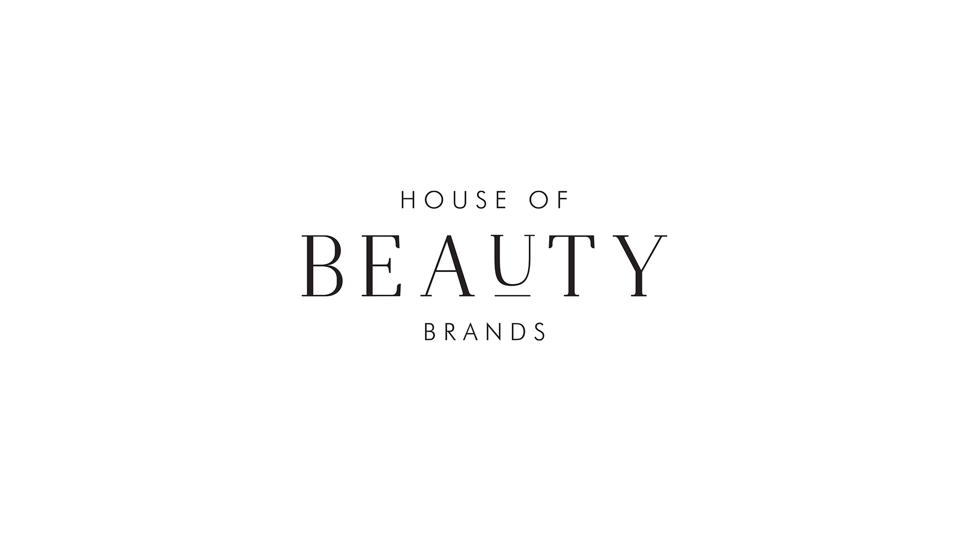
When creating a logo, one should strive for 3 basic qualities - simplicity, timelessness, recognizability. The biggest challenge in this project was to design a logo that in its simplicity encapsulates all the values of the brand.
When creating a logo, one should strive for 3 basic qualities - simplicity, timelessness, recognizability. The biggest challenge in this project was to design a logo that in its simplicity encapsulates all the values of the brand.
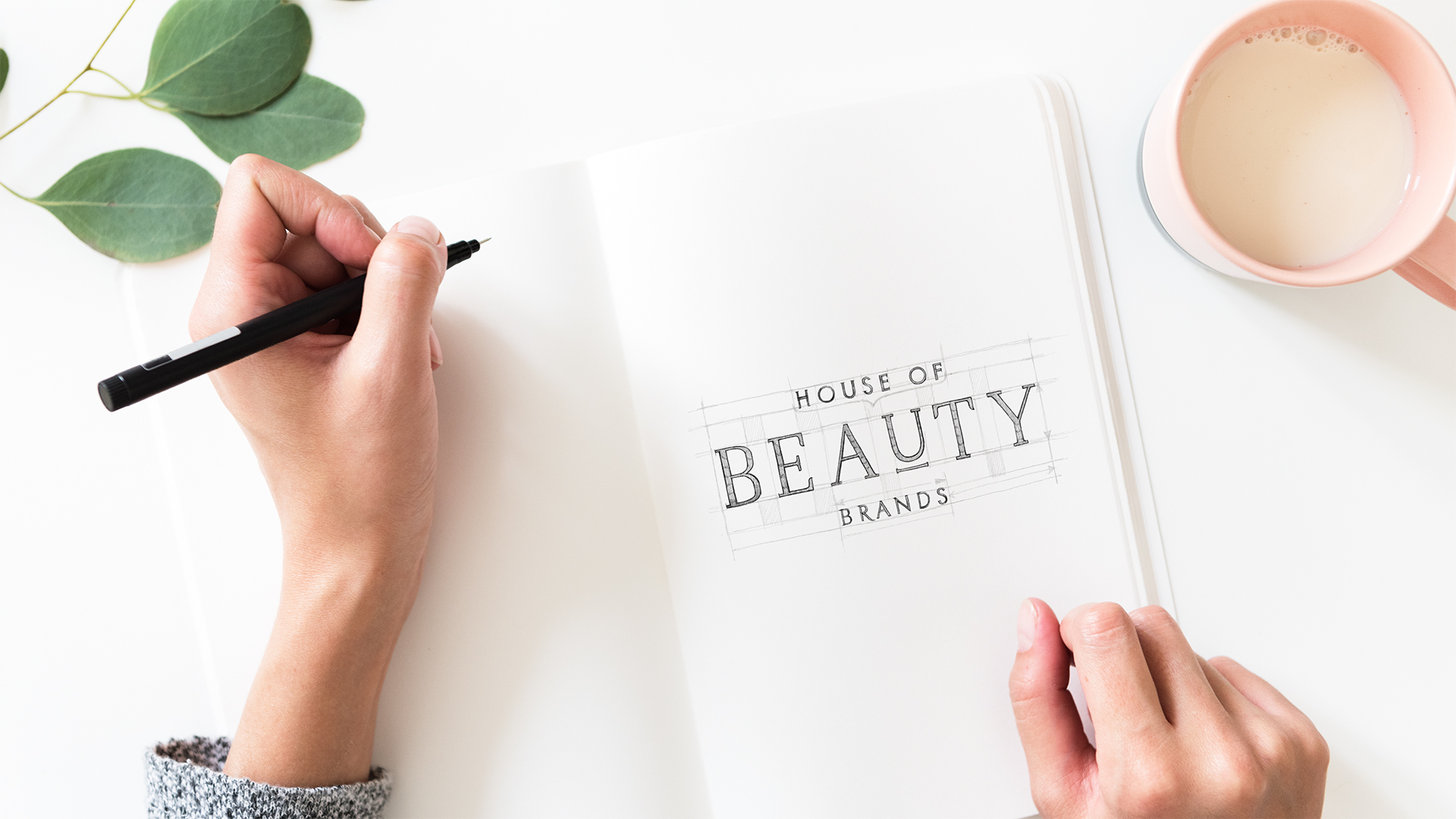
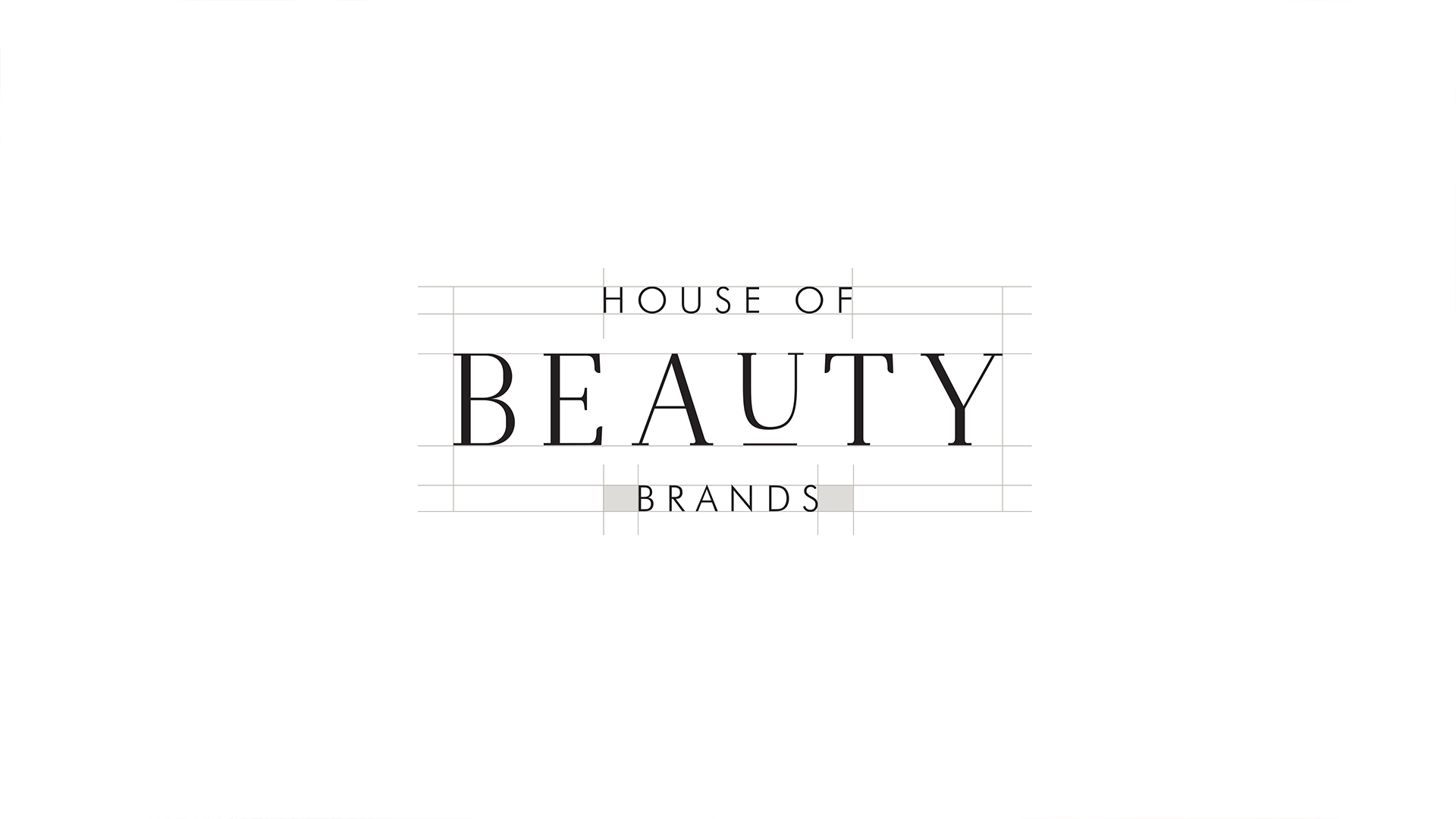
We used a delicate and elegant typeface, highlighting one letter which in Polish means "beauty."

SEE OTHER PROJECTS
FROM OUR PORTFOLIO
Contact us Do you like it?
Call US
+ 48 12 222 00 80
Or write to us!
office@fynk.eu
Contact Us Contact Us Contact Us