


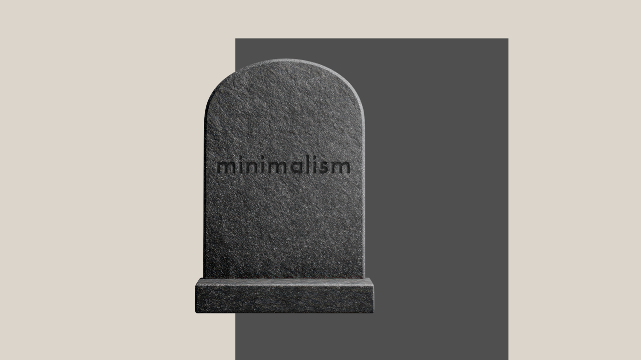
does minimalism still matter in design?
DOES MINIMALISM STILL MATTER IN DESIGN?


02/09/2025
That’s something I’ve been thinking about lately. We live in times of overstimulation and visual clutter. When you look at what’s trending for the past few years, you will see maximalist tendencies, but I would argue that the popularity of maximalism doesn’t make minimalism passe.
I’ve had a personal relationship with minimalism for years. I’m not even sure when it started, but the simplicity always called me. It wasn’t only about the aesthetics, but the whole philosophy of needing less. I’m someone who judges a book by its cover and buys the product for the packaging. I guess it comes with the profession. The products that always caught my attention are these, with a minimalistic design, especially now when the branding of everything seems so loud. A plain one-colour background with lots of negative space, logo, product name in sans serif font, paired with richer materials, and you've bought me.
My theory is that I’m impressed with minimalistic design because I know the back end of it.
Minimalism is hard
Sometimes I hear the opinion that minimalism is the easy way out. It always comes from people outside the industry. Because, in reality, designing with less is much harder. Ironically, fewer elements make a stronger design. But also with fewer elements, every detail counts, and every mistake is visible.
By comparison, maximalism is more forgiving, and any shortcuts can get lost in the crowd of elements. When you remove the decoration and chaos, there’s nothing to hide the mistakes with. It leaves you with the key components, and those better be strong.
It can be a blessing and a curse. As mentioned earlier, it makes every mistake more visible, but at the same time, it forces the clarity of design. It’s easy to make everything feel flat. The fewer elements you have, the more responsibility each one carries: type choices, layouts, spacing & alignment. Even the smallest decisions can impact how a design feels, because everything needs to be perfectly balanced.
Minimalism exposes everything, and that’s why it works.
Clarity of Design
In minimalism, we’re playing with clarity. Removing distractions enables the main message to shine, and it clears visual clutter. It also increases the potential for recognition. A simple, clear message is more memorable, and it stays with the receiver for longer.
Of course, the chaos can be more intriguing and encourage longer interaction, but you can create the same interest or intrigue with subtlety. Storytelling plays a significant role in branding, but it's not reserved only for maximalist projects with multiple threads. You need only a few key elements for this (which we have already discussed here). With a skilful use of hierarchy, you can guide the viewer through your design and use minimalistic composition as a means of storytelling.
On a shelf, you have seconds to catch someone's eye. Visual clutter might grab attention, but without clarity, it won’t convince anyone to make a purchase. People buy what they need and what they want, but no one buys a pig in a poke. Even with the popular mystery boxes, you have a clear idea of what could be inside, or at least that it’s the mystery box – even though the product is a surprise, the message is clear, and you’re aware of it.
You can achieve clarity in minimalism by ensuring the proper hierarchy and that all the elements you’ve chosen are coherent. The scale, contrast, and negative space become your main tools. They lead the viewer’s eye from point to point to deliver the story in a distinct and uncomplicated way. When you’re getting rid of unnecessary components, the one that is left almost always is typography. The font that you choose will define the characteristics of the product and its audience.
The purity in minimal design delivers the message, while also allowing the product itself to shine. It seems to be saying, "I don’t need fancy packaging, because I’m this good."
Ironically, fancy design is often minimal because it looks high-priced.
Is Minimalism for Rich?
I remember walking into an Aesop store. The moment you enter, you can feel the philosophy behind their brand. It’s not just about products, but the whole atmosphere of the space. They have implemented their minimalistic branding style into all areas of the business. They made it not only about how the products look, but also about how those products present. The muted colour palette, the repetition of shapes, and the careful arrangements. It feels expensive.
That experience stuck with me. The design, from the labels to their website and even their store architecture, reflects the same intentional restraint. There are no flashy slogans or exploding visuals. It creates a feeling of calm that is perfect for a skin care brand; it also elevates it and makes it more premium by creating a quiet luxury vibe.
It brings me to the theory that minimalism is only for the wealthy. It comes from the assumption that you don’t need more, because you know you can get it whenever necessary. It also connects with the rule of quality over quantity. In the short run, quality seems more expensive, ergo, it’s for the rich. In the long run, though, it doesn’t work like this; one good quality item will serve you longer than a cheaper version, and as a result, you will need to buy more and spend more.
Minimalism is about the intention. Choosing only essentials raises their value; it works both when we’re talking about the things we own or the elements used in design, as it increases the importance of each one of them. As Dieter Rams said, it’s about „less but better”. His rule,“Good design is as little design as possible,” isn’t about doing the minimum. Designs created by the Braun company in the second half of the 20th century, during his work there, are a perfect example of good minimalistic design. Not only products themselves, but also the whole branding and advertising visuals. Simplicity, hierarchy, and a clear message. They are an example of a brand that isn’t associated with luxury or high-end prices, but their messaging and offer reflect high quality, which makes the brand more premium.
Making Minimalism Work
Of course, not every minimalistic project needs to be monochromatic and unimaginative (as some might say). Yes, if there’s no substance behind the design, minimalism can fall flat. Still, you can do minimalistic projects in a fun, even bold way.
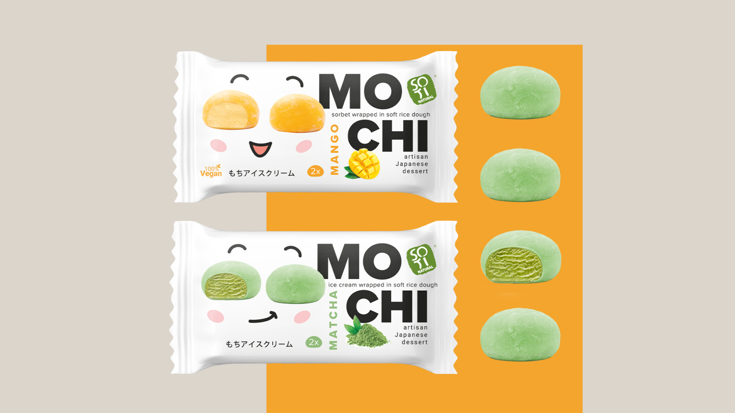
A great example of this is packaging for brands like Soti Natural. It's a company that values care and innovation; it draws inspiration from Asian design, which makes minimalism an obvious choice for their branding. At the same time, they target Gen Z as their main customer base, so it needs to be youthful. These aren’t just beige-on-beige designs. They use colour and would be considered playful, yet still minimalistic. The simple white background and black typography go with the considered use of colour in the appetizer. The appetiser itself also serves as a fun graphic element. The intentional use of negative space creates balance. Typography serves as a crucial part of composition, framing it. Sometimes, when designing for them, we switch things up and add more colour in the background, but it doesn’t change the minimalistic feeling of the design.
I think that’s the sweet spot. Minimalism doesn’t mean avoiding colour or personality. It’s one of the most powerful tools in design because it defines balance and choice of essential elements for the project.
As stated earlier, minimalism is a philosophy that is useful in many spheres of life, including design. It can’t go out of style. Not for real. The skill of creating good minimalistic projects improves the general quality of design because the knowledge involved applies to other design styles. Therefore, I would argue, minimalism is the basis for quality design, which makes it resistant to trends.
I’ve had a personal relationship with minimalism for years. I’m not even sure when it started, but the simplicity always called me. It wasn’t only about the aesthetics, but the whole philosophy of needing less. I’m someone who judges a book by its cover and buys the product for the packaging. I guess it comes with the profession. The products that always caught my attention are these, with a minimalistic design, especially now when the branding of everything seems so loud. A plain one-colour background with lots of negative space, logo, product name in sans serif font, paired with richer materials, and you've bought me.
My theory is that I’m impressed with minimalistic design because I know the back end of it.
Minimalism is hard
Sometimes I hear the opinion that minimalism is the easy way out. It always comes from people outside the industry. Because, in reality, designing with less is much harder. Ironically, fewer elements make a stronger design. But also with fewer elements, every detail counts, and every mistake is visible.
By comparison, maximalism is more forgiving, and any shortcuts can get lost in the crowd of elements. When you remove the decoration and chaos, there’s nothing to hide the mistakes with. It leaves you with the key components, and those better be strong.
It can be a blessing and a curse. As mentioned earlier, it makes every mistake more visible, but at the same time, it forces the clarity of design. It’s easy to make everything feel flat. The fewer elements you have, the more responsibility each one carries: type choices, layouts, spacing & alignment. Even the smallest decisions can impact how a design feels, because everything needs to be perfectly balanced.
Minimalism exposes everything, and that’s why it works.
Clarity of Design
In minimalism, we’re playing with clarity. Removing distractions enables the main message to shine, and it clears visual clutter. It also increases the potential for recognition. A simple, clear message is more memorable, and it stays with the receiver for longer.
Of course, the chaos can be more intriguing and encourage longer interaction, but you can create the same interest or intrigue with subtlety. Storytelling plays a significant role in branding, but it's not reserved only for maximalist projects with multiple threads. You need only a few key elements for this (which we have already discussed here). With a skilful use of hierarchy, you can guide the viewer through your design and use minimalistic composition as a means of storytelling.
On a shelf, you have seconds to catch someone's eye. Visual clutter might grab attention, but without clarity, it won’t convince anyone to make a purchase. People buy what they need and what they want, but no one buys a pig in a poke. Even with the popular mystery boxes, you have a clear idea of what could be inside, or at least that it’s the mystery box – even though the product is a surprise, the message is clear, and you’re aware of it.
You can achieve clarity in minimalism by ensuring the proper hierarchy and that all the elements you’ve chosen are coherent. The scale, contrast, and negative space become your main tools. They lead the viewer’s eye from point to point to deliver the story in a distinct and uncomplicated way. When you’re getting rid of unnecessary components, the one that is left almost always is typography. The font that you choose will define the characteristics of the product and its audience.
The purity in minimal design delivers the message, while also allowing the product itself to shine. It seems to be saying, "I don’t need fancy packaging, because I’m this good."
Ironically, fancy design is often minimal because it looks high-priced.
Is Minimalism for Rich?
I remember walking into an Aesop store. The moment you enter, you can feel the philosophy behind their brand. It’s not just about products, but the whole atmosphere of the space. They have implemented their minimalistic branding style into all areas of the business. They made it not only about how the products look, but also about how those products present. The muted colour palette, the repetition of shapes, and the careful arrangements. It feels expensive.
That experience stuck with me. The design, from the labels to their website and even their store architecture, reflects the same intentional restraint. There are no flashy slogans or exploding visuals. It creates a feeling of calm that is perfect for a skin care brand; it also elevates it and makes it more premium by creating a quiet luxury vibe.
It brings me to the theory that minimalism is only for the wealthy. It comes from the assumption that you don’t need more, because you know you can get it whenever necessary. It also connects with the rule of quality over quantity. In the short run, quality seems more expensive, ergo, it’s for the rich. In the long run, though, it doesn’t work like this; one good quality item will serve you longer than a cheaper version, and as a result, you will need to buy more and spend more.
Minimalism is about the intention. Choosing only essentials raises their value; it works both when we’re talking about the things we own or the elements used in design, as it increases the importance of each one of them. As Dieter Rams said, it’s about „less but better”. His rule,“Good design is as little design as possible,” isn’t about doing the minimum. Designs created by the Braun company in the second half of the 20th century, during his work there, are a perfect example of good minimalistic design. Not only products themselves, but also the whole branding and advertising visuals. Simplicity, hierarchy, and a clear message. They are an example of a brand that isn’t associated with luxury or high-end prices, but their messaging and offer reflect high quality, which makes the brand more premium.
Making Minimalism Work
Of course, not every minimalistic project needs to be monochromatic and unimaginative (as some might say). Yes, if there’s no substance behind the design, minimalism can fall flat. Still, you can do minimalistic projects in a fun, even bold way.
A great example of this is packaging for brands like Soti Natural. It's a company that values care and innovation; it draws inspiration from Asian design, which makes minimalism an obvious choice for their branding. At the same time, they target Gen Z as their main customer base, so it needs to be youthful. These aren’t just beige-on-beige designs. They use colour and would be considered playful, yet still minimalistic. The simple white background and black typography go with the considered use of colour in the appetizer. The appetiser itself also serves as a fun graphic element. The intentional use of negative space creates balance. Typography serves as a crucial part of composition, framing it. Sometimes, when designing for them, we switch things up and add more colour in the background, but it doesn’t change the minimalistic feeling of the design.
I think that’s the sweet spot. Minimalism doesn’t mean avoiding colour or personality. It’s one of the most powerful tools in design because it defines balance and choice of essential elements for the project.
As stated earlier, minimalism is a philosophy that is useful in many spheres of life, including design. It can’t go out of style. Not for real. The skill of creating good minimalistic projects improves the general quality of design because the knowledge involved applies to other design styles. Therefore, I would argue, minimalism is the basis for quality design, which makes it resistant to trends.